TIN has been deeply immersed in a rebranding project for Studio Goyu, focusing on building a new brand identity that reflects its core values. Beginning with the naming process, we aimed to express the direction Studio Goyu pursues, translating this vision into visual elements. Through this process, we clarified the brand’s identity and strategically applied it across various applications to ensure that Studio Goyu’s essence is effectively communicated to its clients.
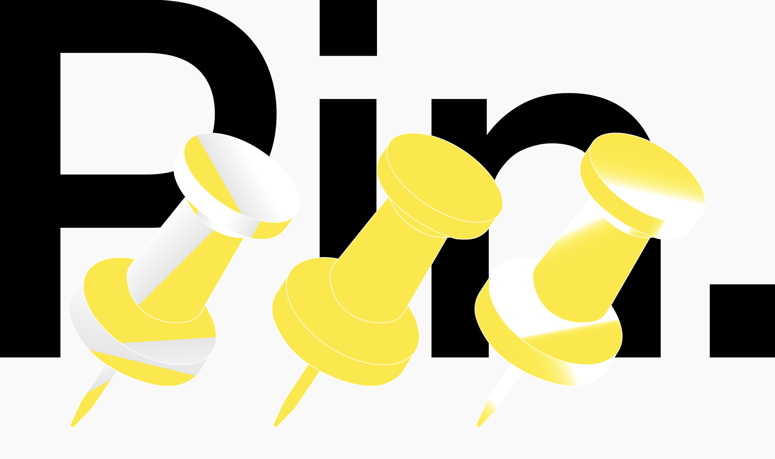
The name “Pin” was created based on the keywords Praxinoscope, Circle, Infinity, and Continuity. A praxinoscope is a technique that arranges multiple images in sequence, creating the illusion of movement. Just as a central axis or reference point is needed to express images like a moving picture, “Pin” signifies a tool used to fix or mark something in place, symbolizing the essence of this technique.
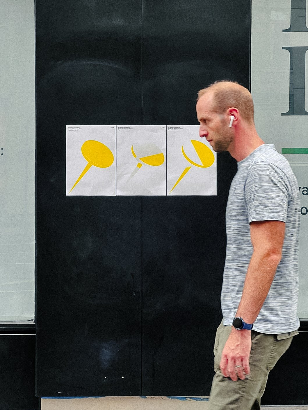
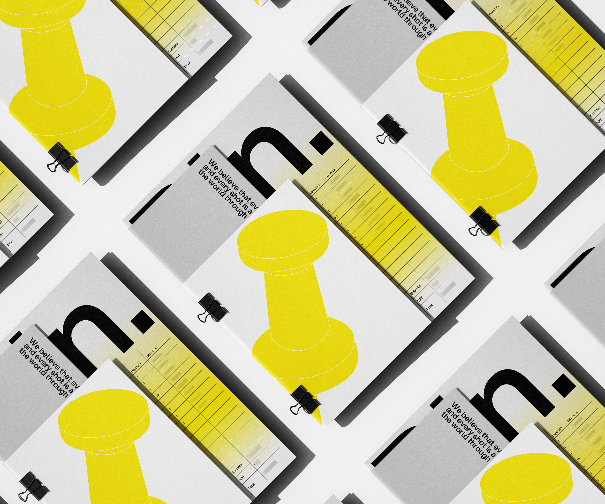
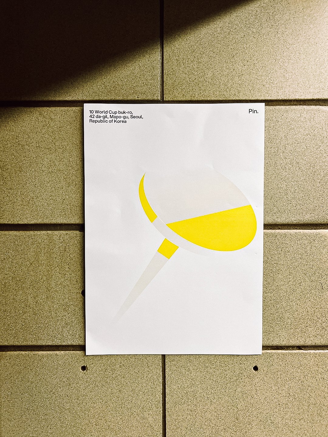
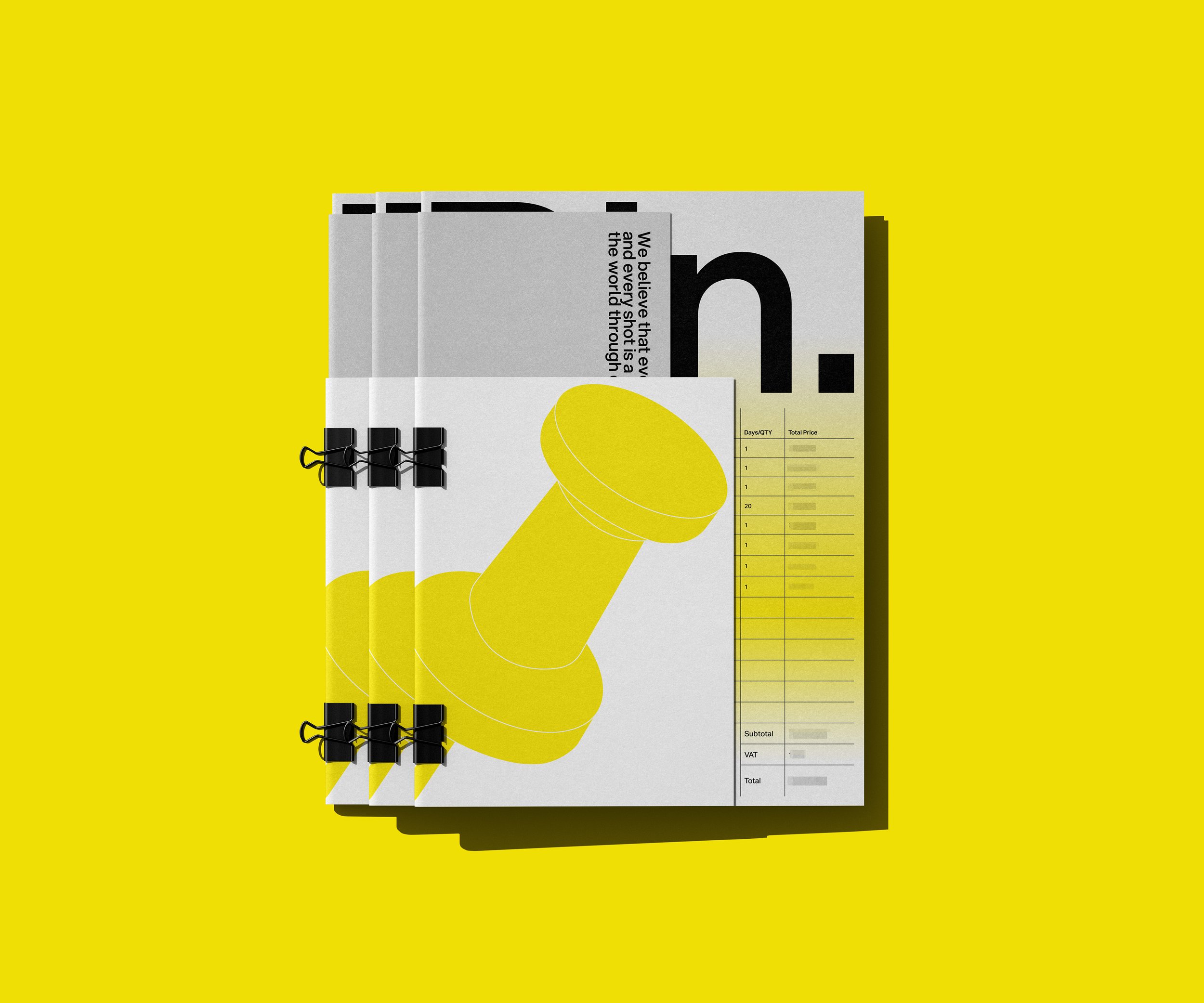
The symbol of PIN Production is inspired by the form of a pin, visually embodying precision and stability. The color palette is composed of Zinc Yellow, Silver, White, and their gradients. The smooth transitions between these colors add depth and a multidimensional feel, visually expressing the brand’s innovation and modern sensibility.
Client - Studio Goyu
Project - Creative Direction, Naming, Brand Identity, Brand Guideline