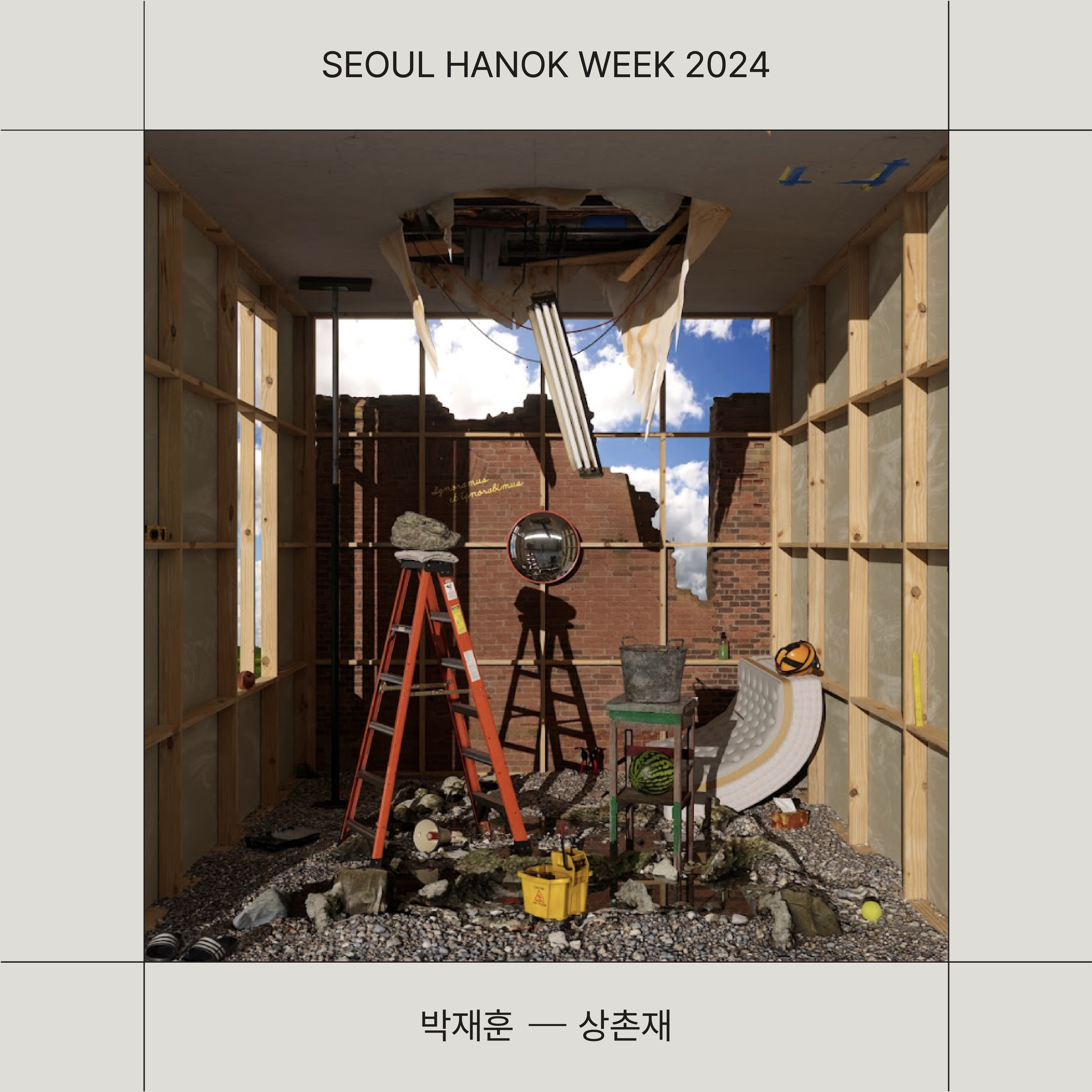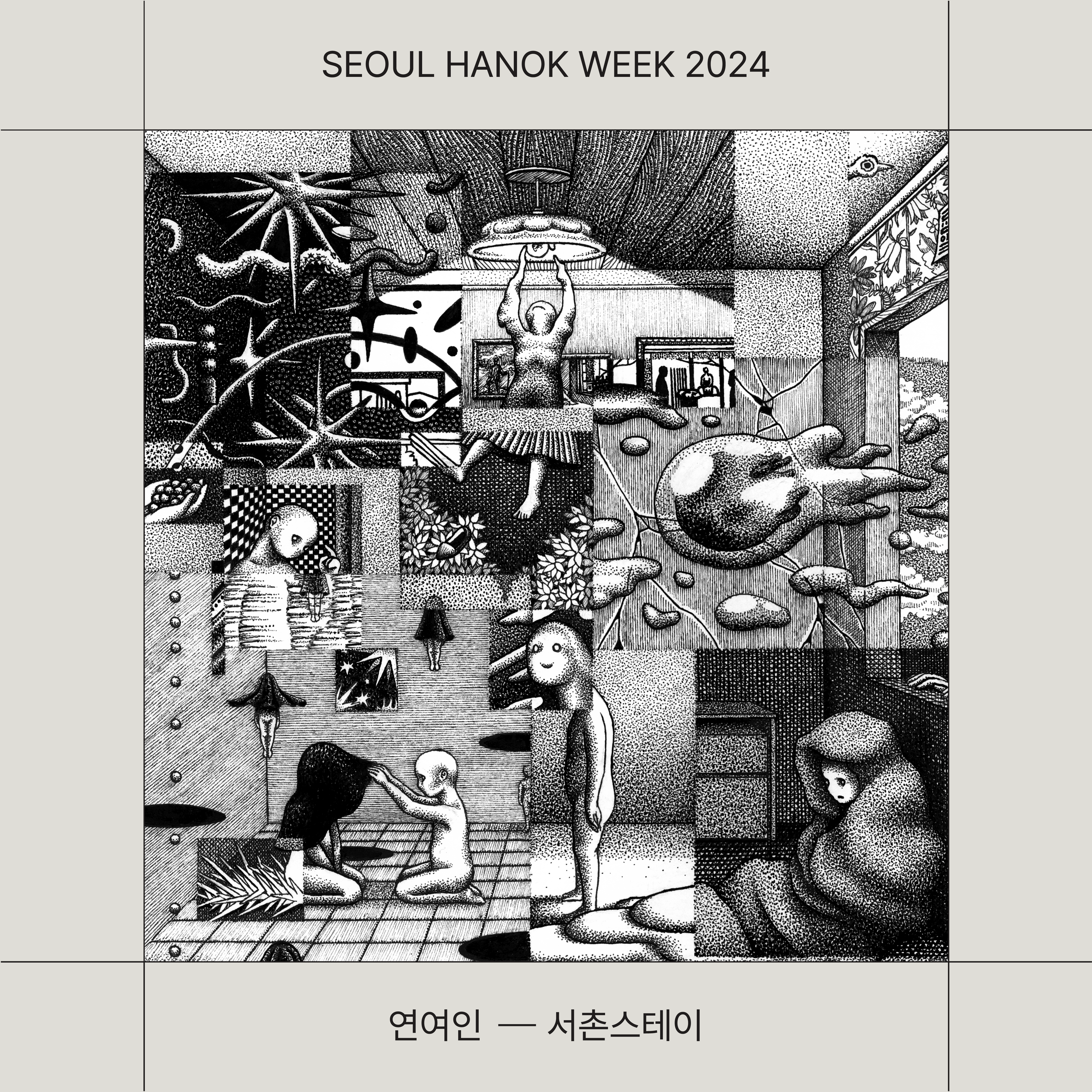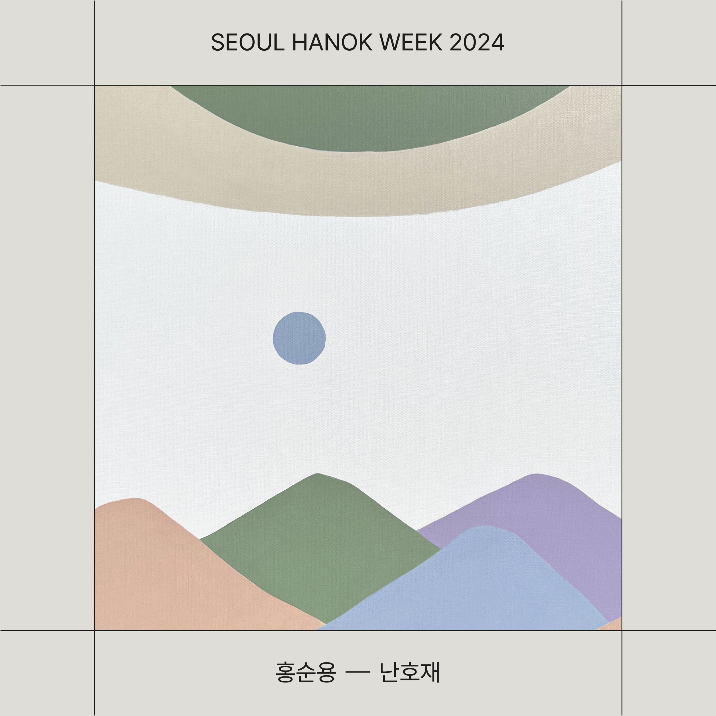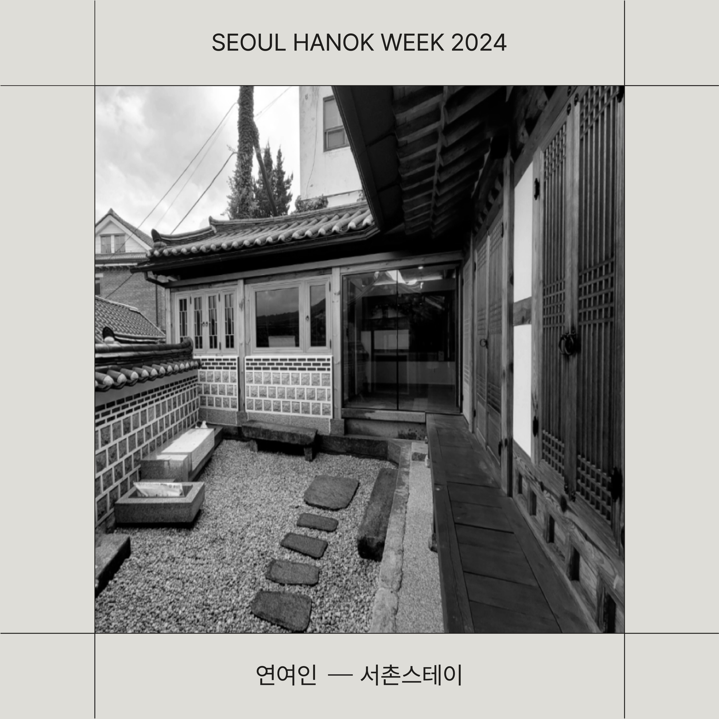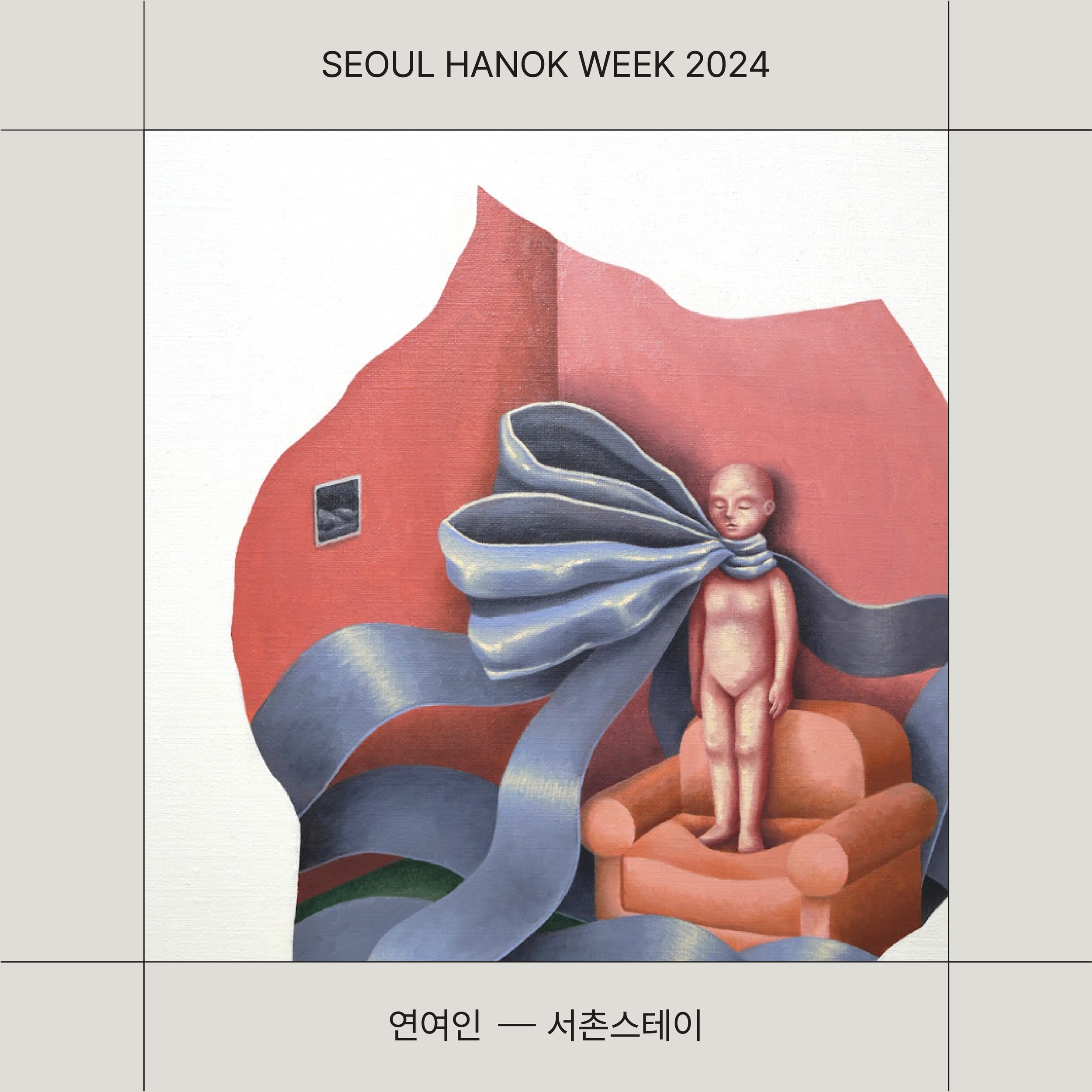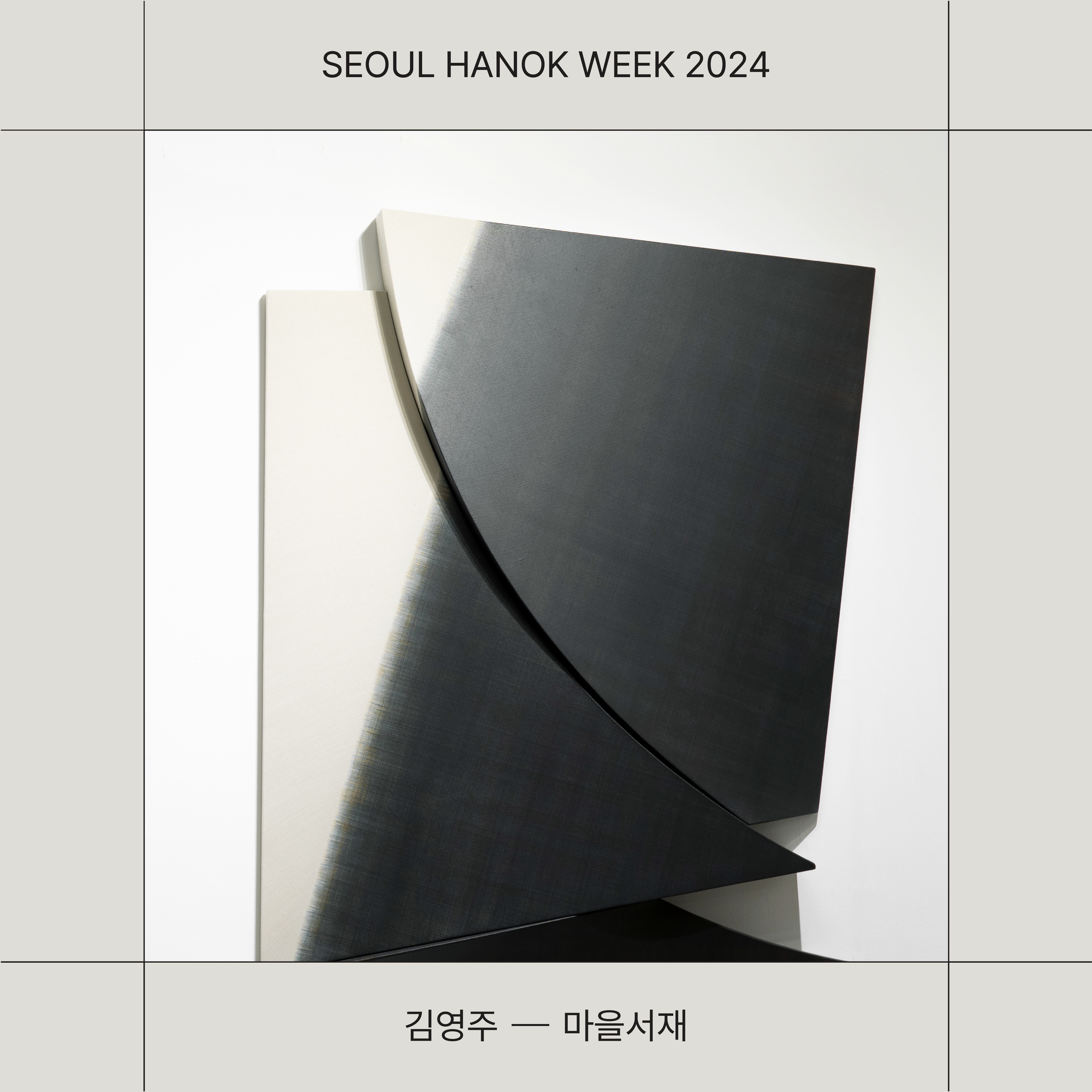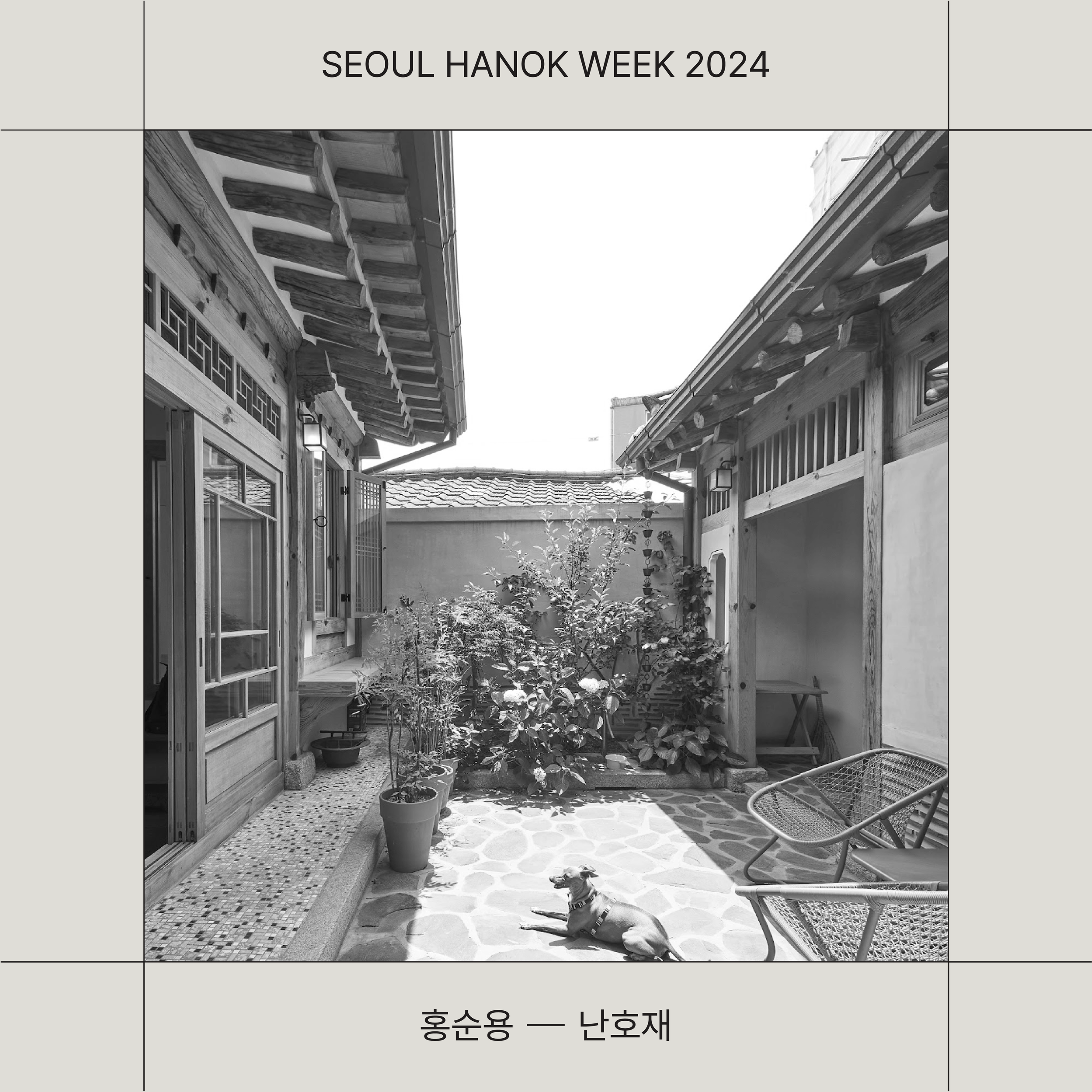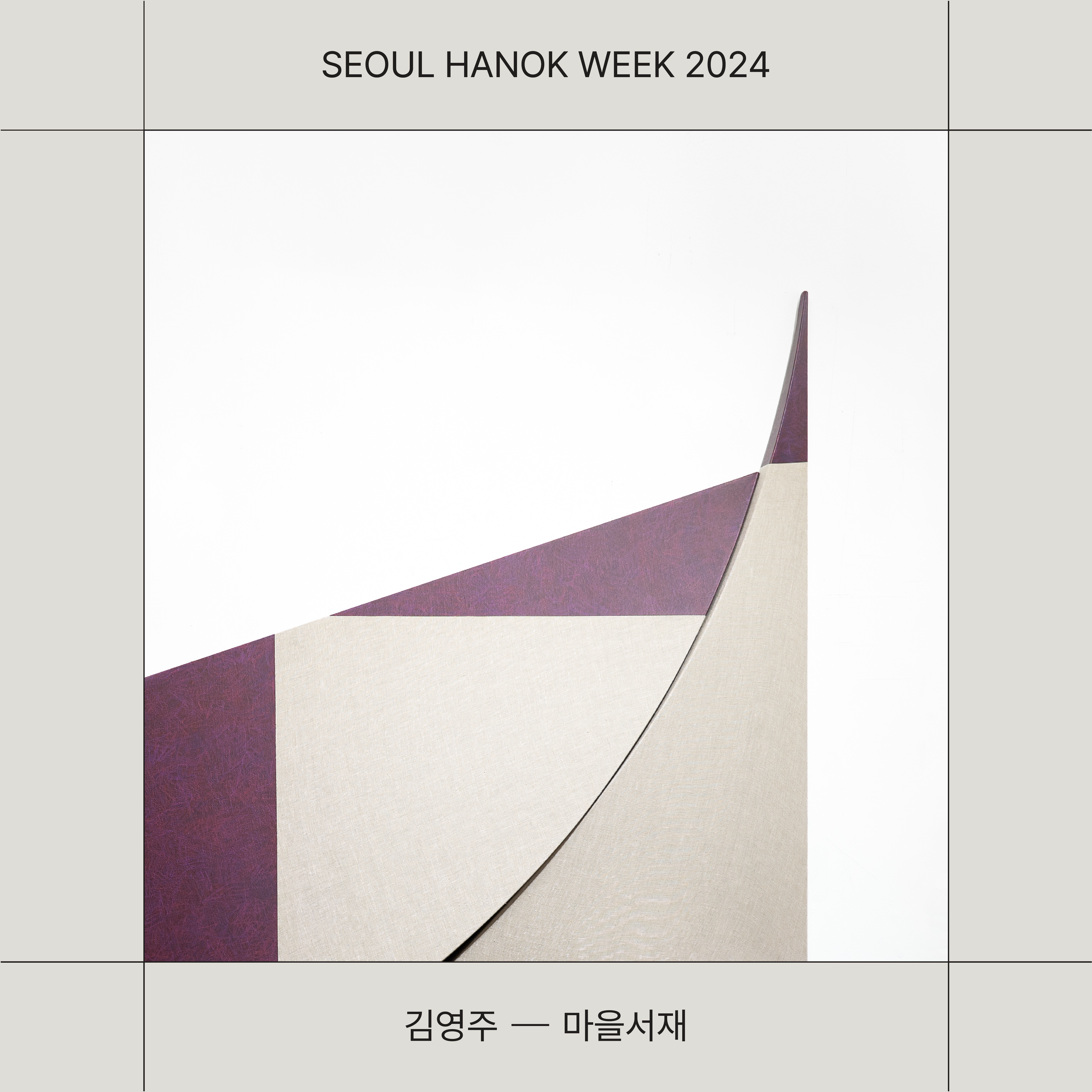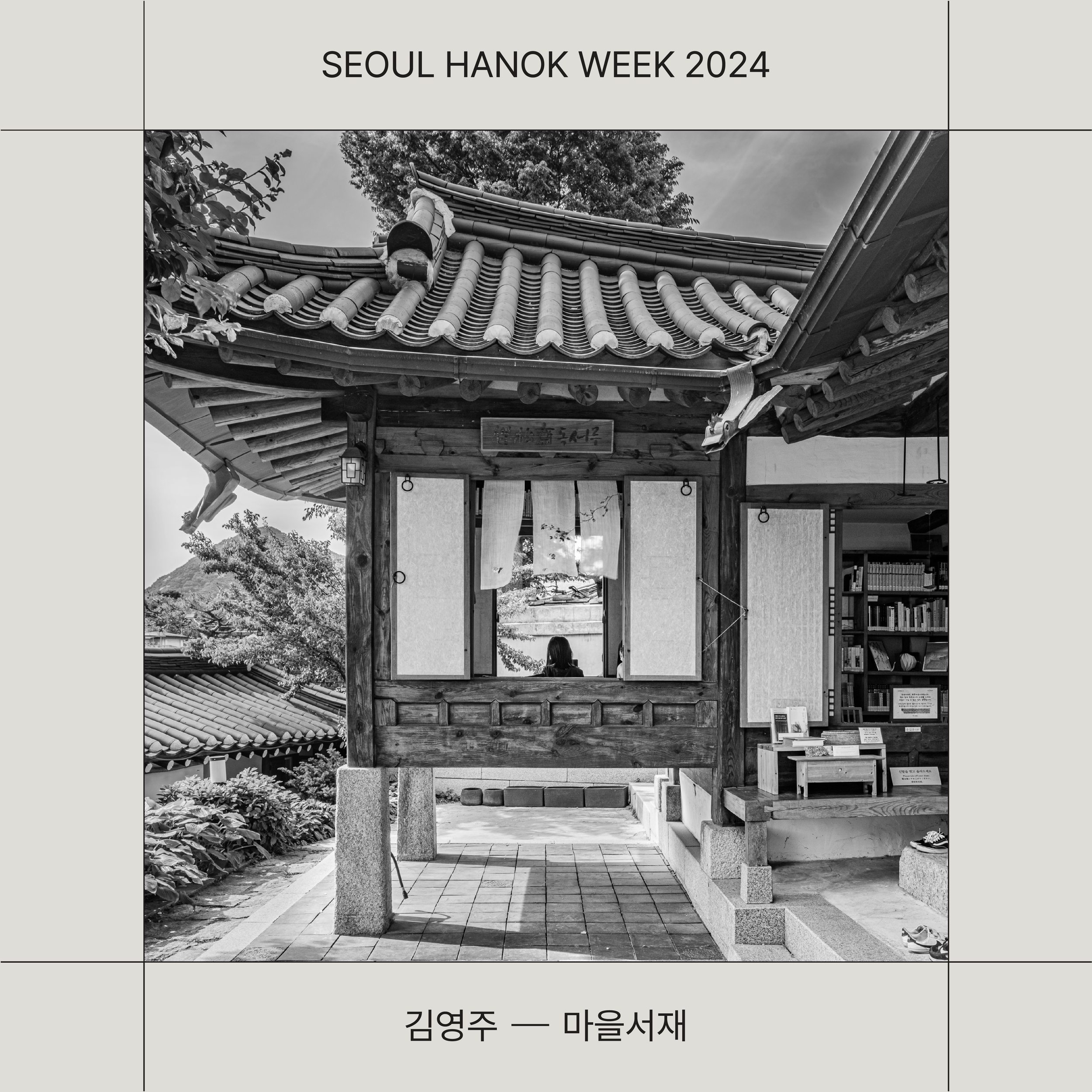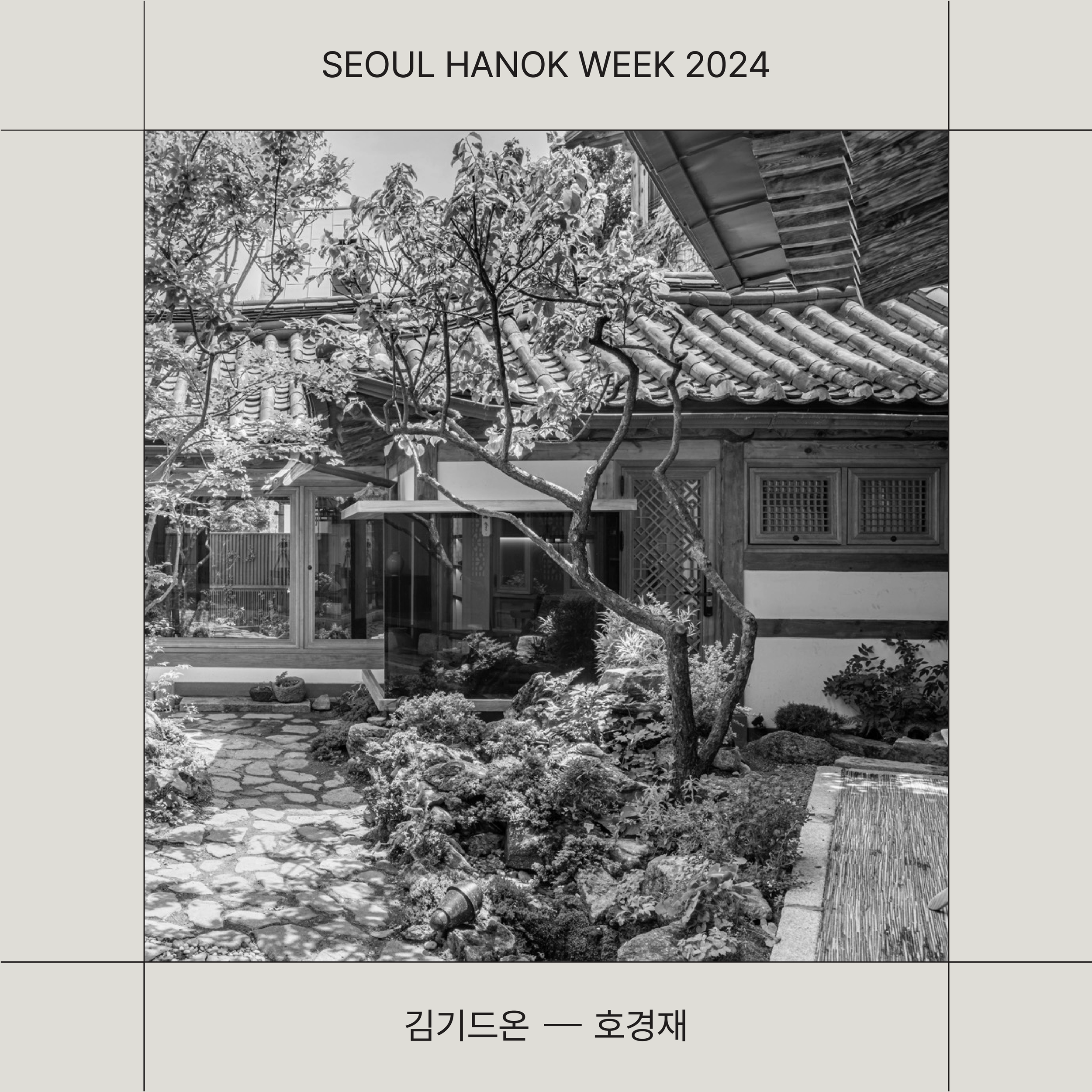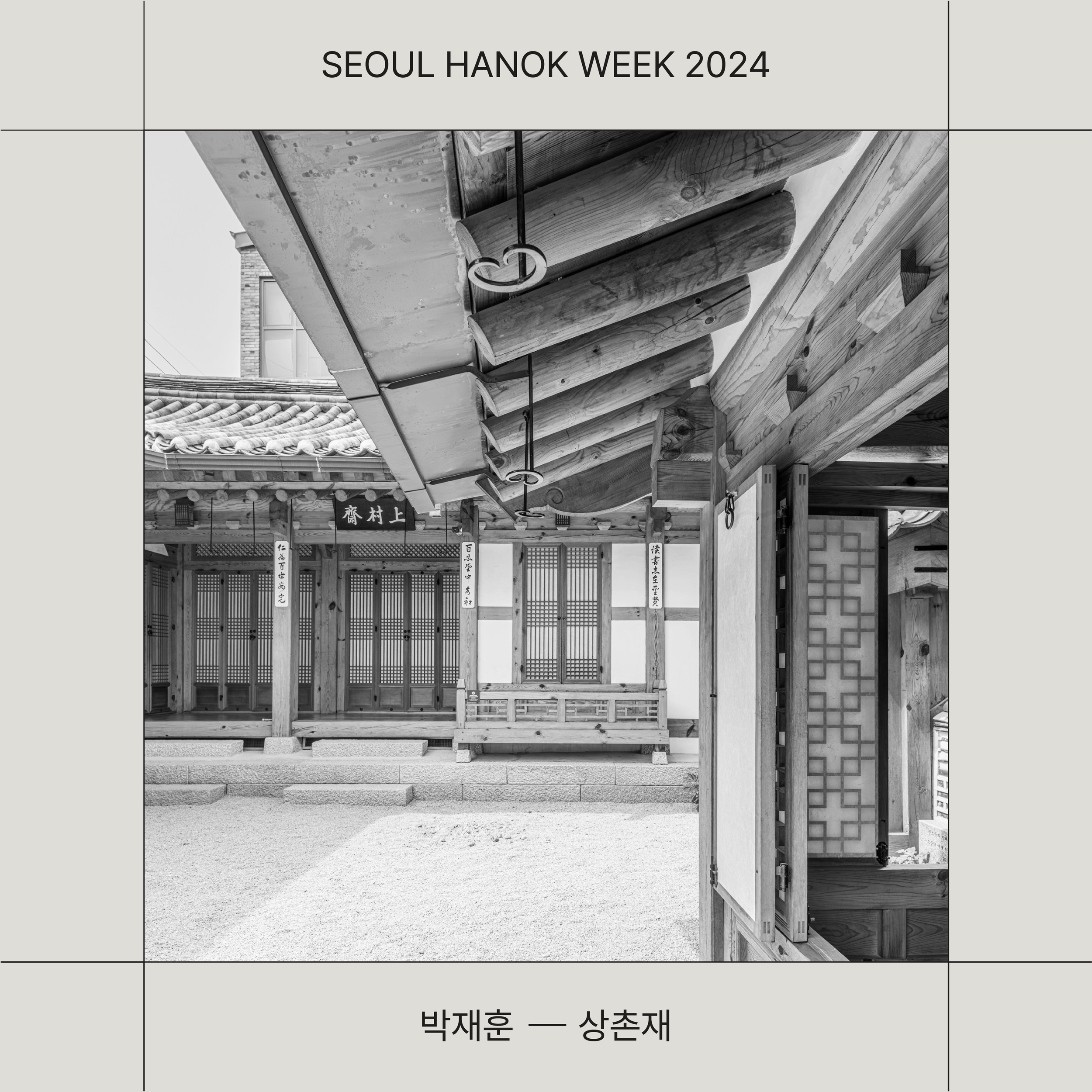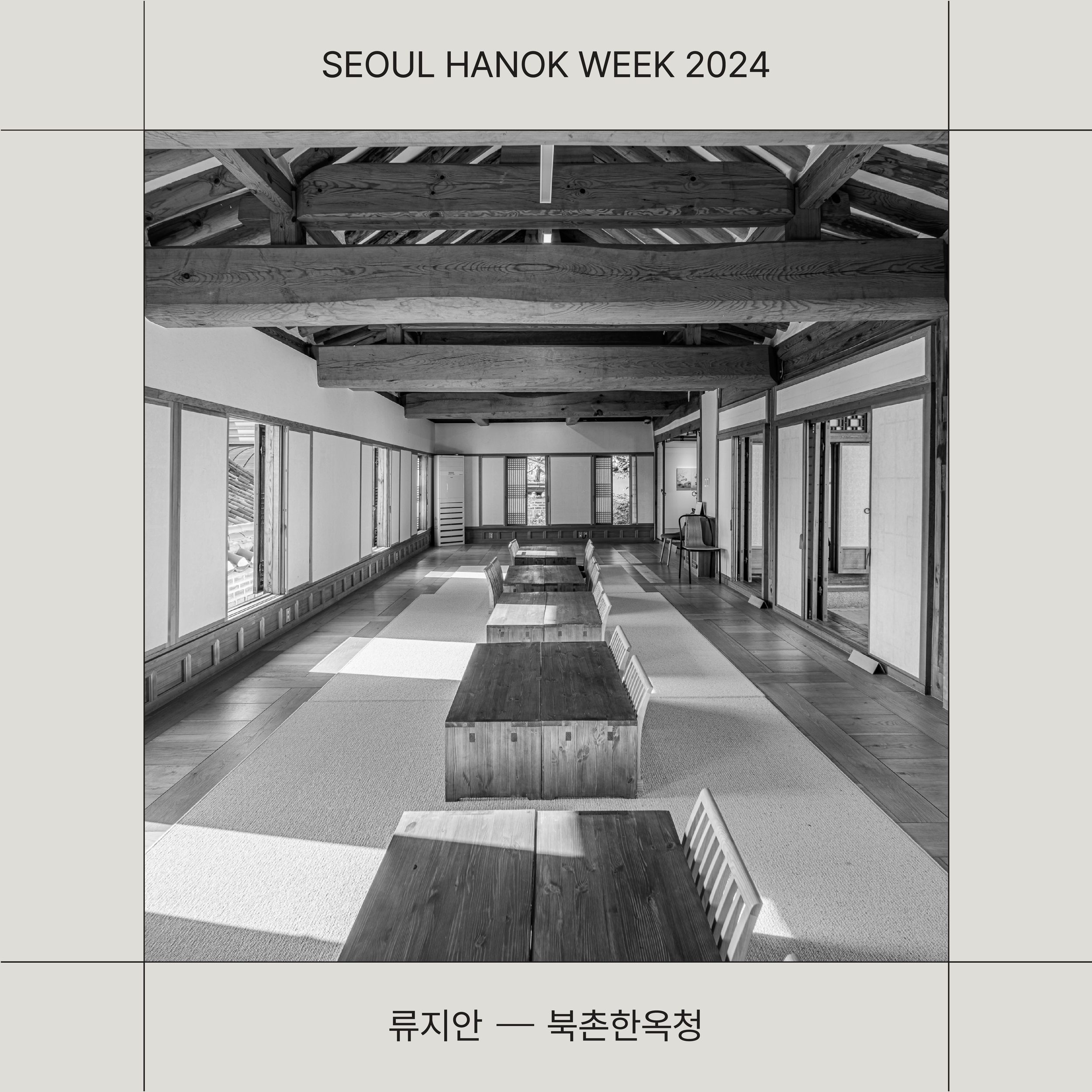
The branding and design work for the Seoul Hanok Week and one of its programs, the Resonance of Space exhibition, emphasized the harmony between tradition and modernity, as well as the aesthetics of space. The branding for both projects has its own unique visual identity, carefully designed to match the theme and character of the exhibition.
Seoul Hanok Week Branding
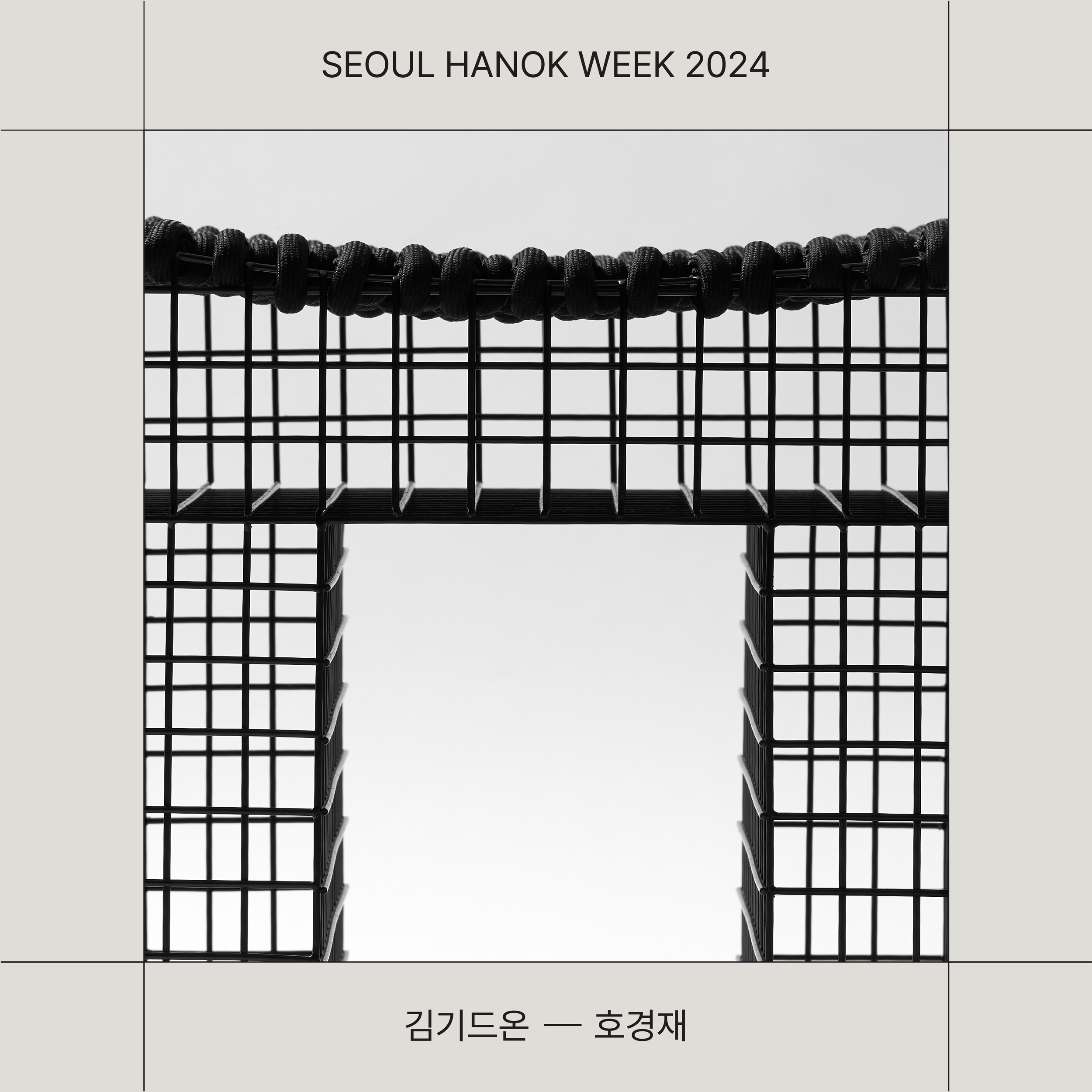
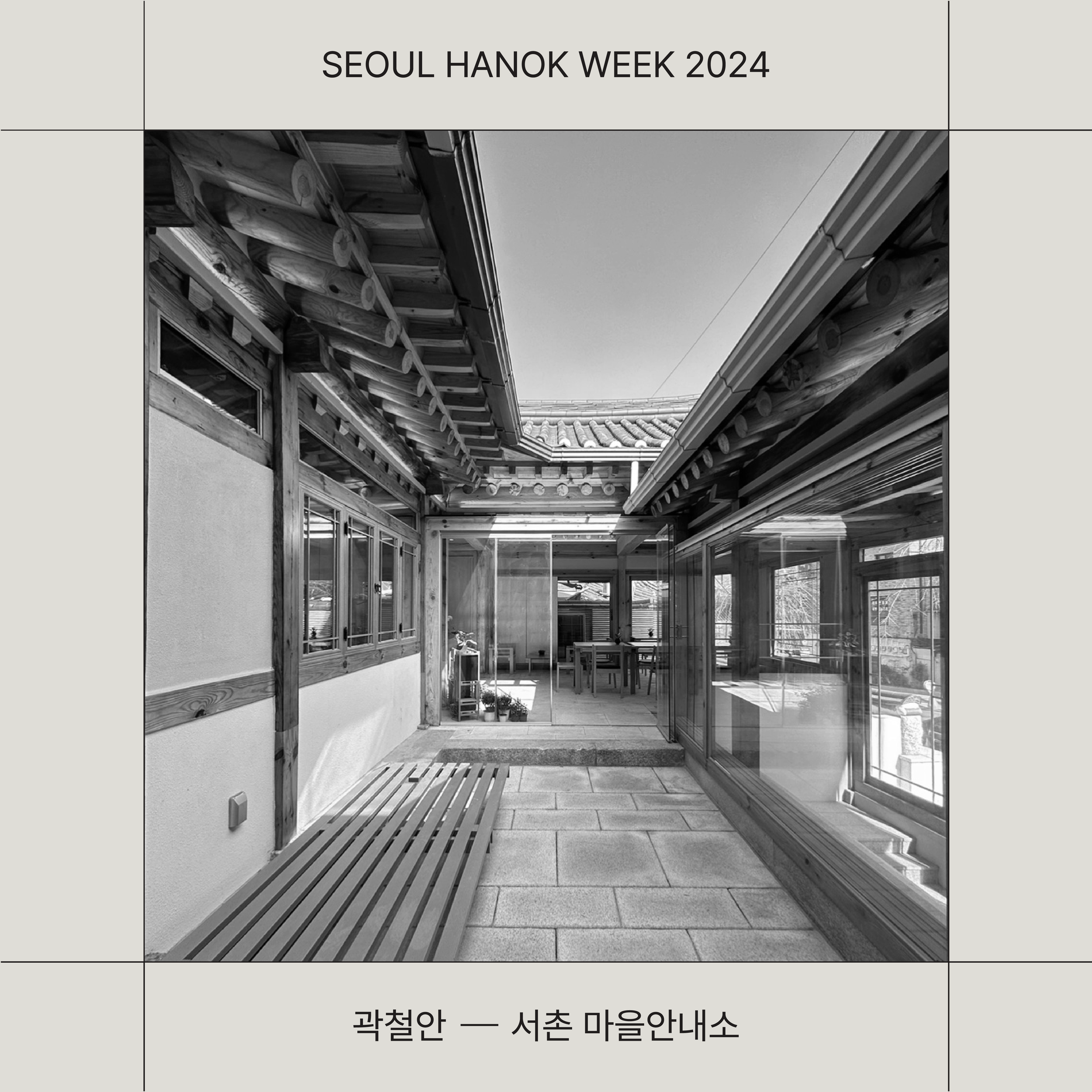
The branding for Seoul Hanok Week used the green color from the existing BI (Brand Identity) of ‘Seoul Hanok’ as a point color, combined with black and ivory, to reflect the natural and stable image of Hanok. Korean typography was used to visually express the beauty and curves of Hanok. The main graphic asset was composed of squares and combinations of various square shapes, emphasizing the sense of space and structural beauty of Hanok. These squares, while simple, evoke the complex architectural elements of traditional Hanok, reinterpreting its aesthetics in a modern and sophisticated way.
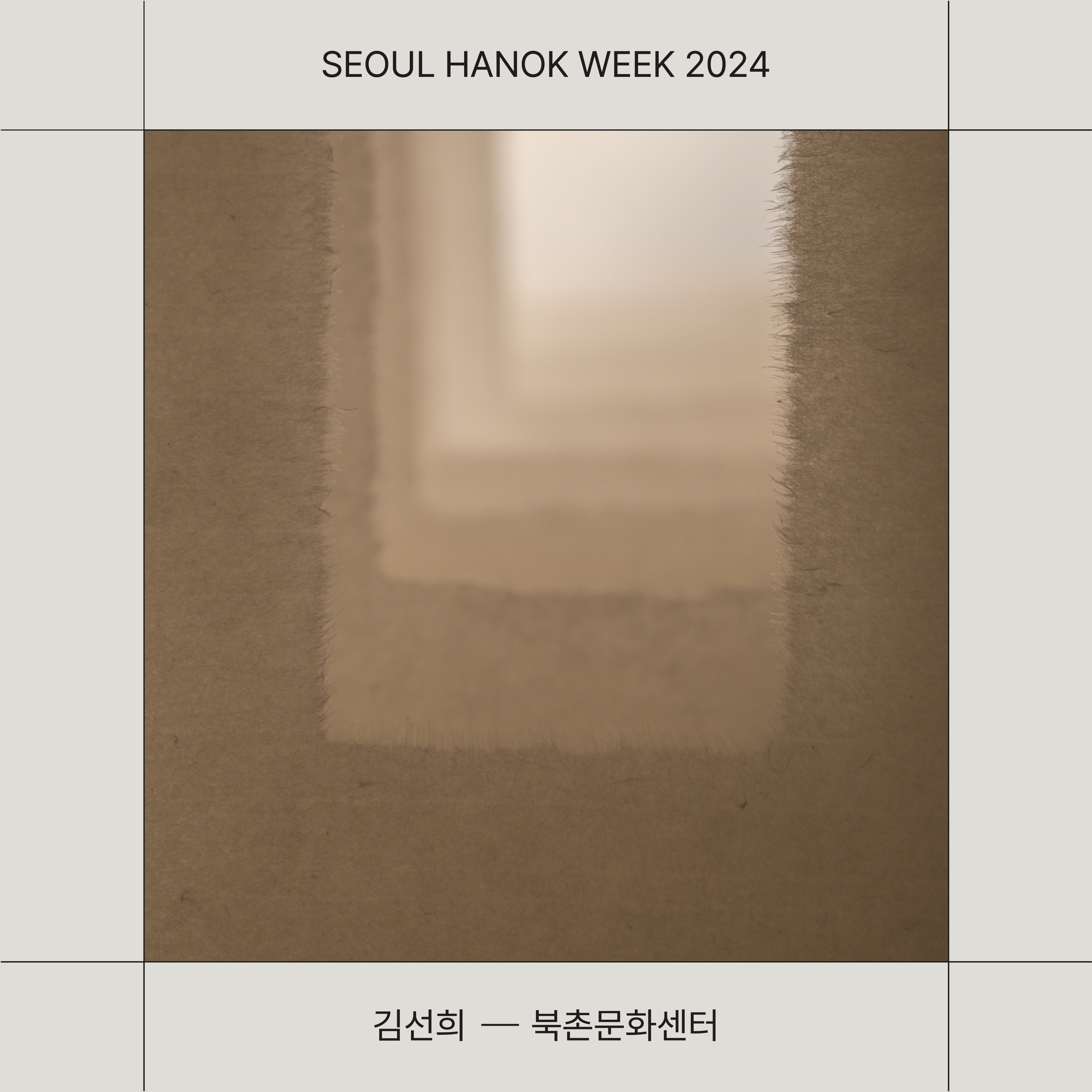
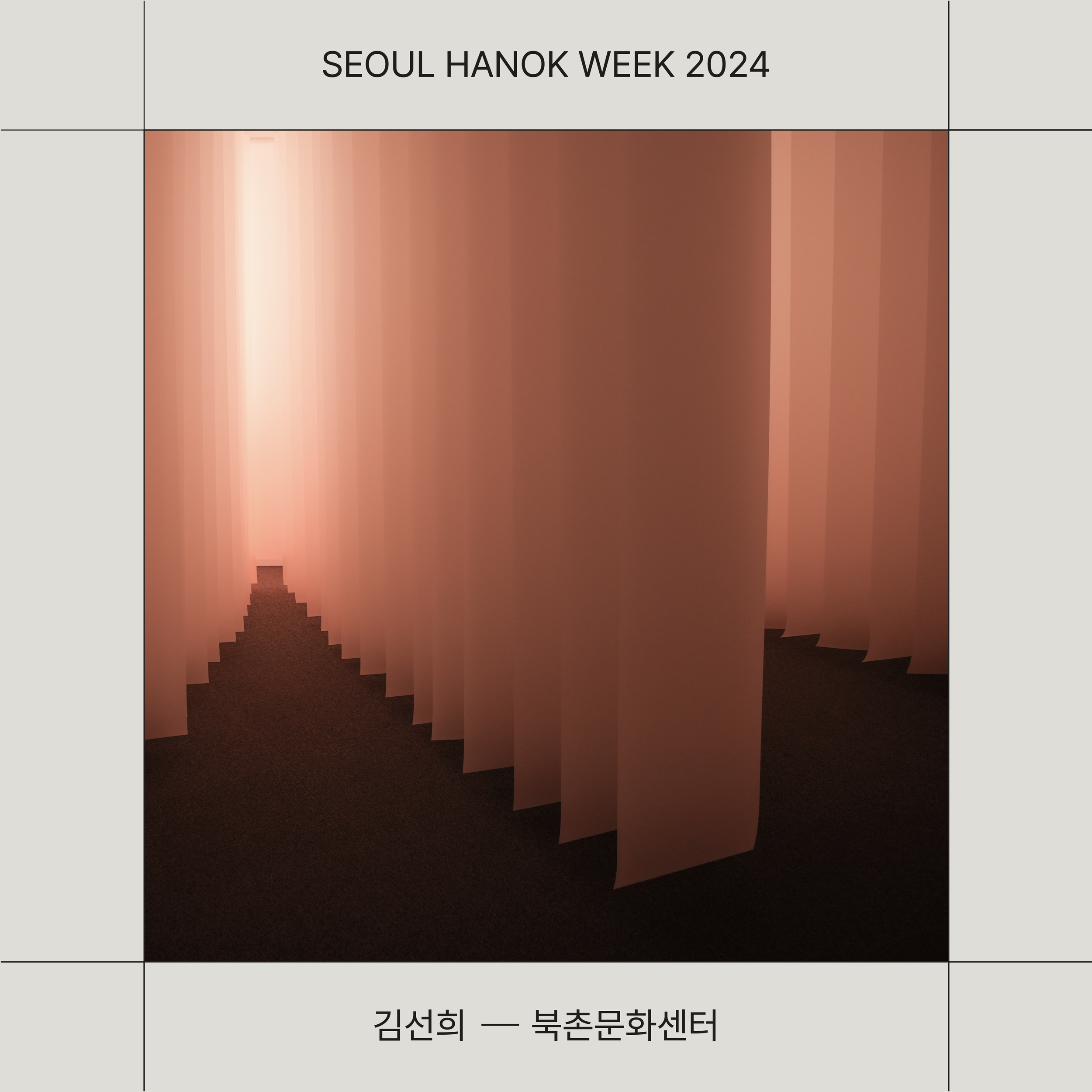
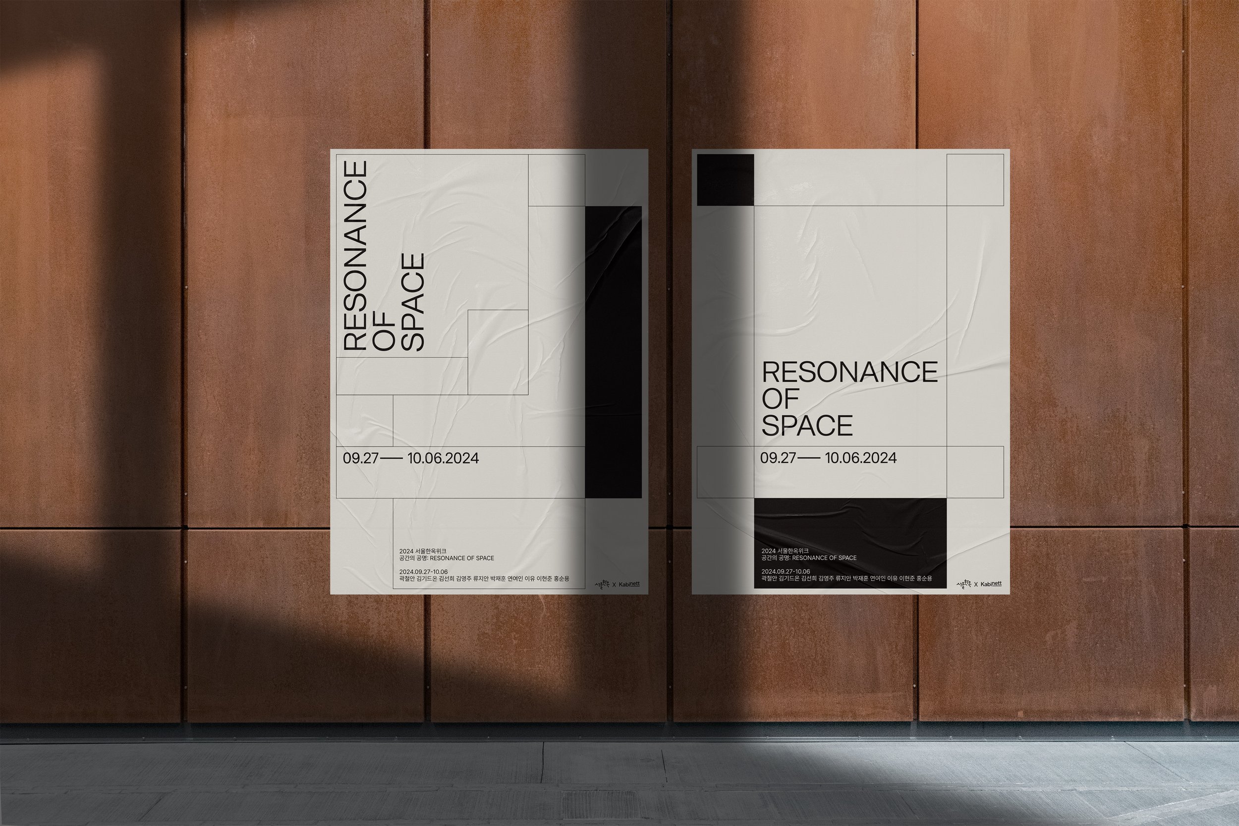
Resonance of Space Exhibition Branding
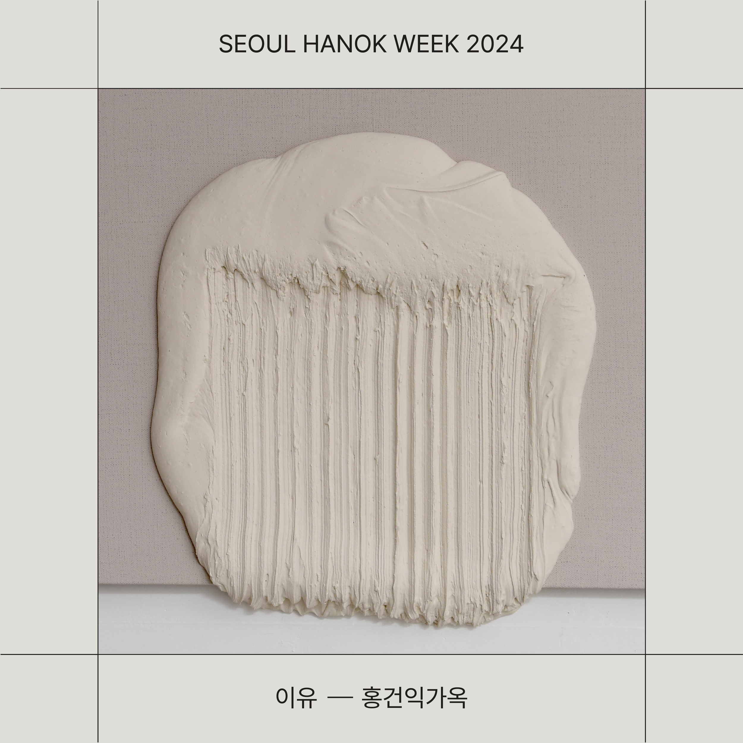
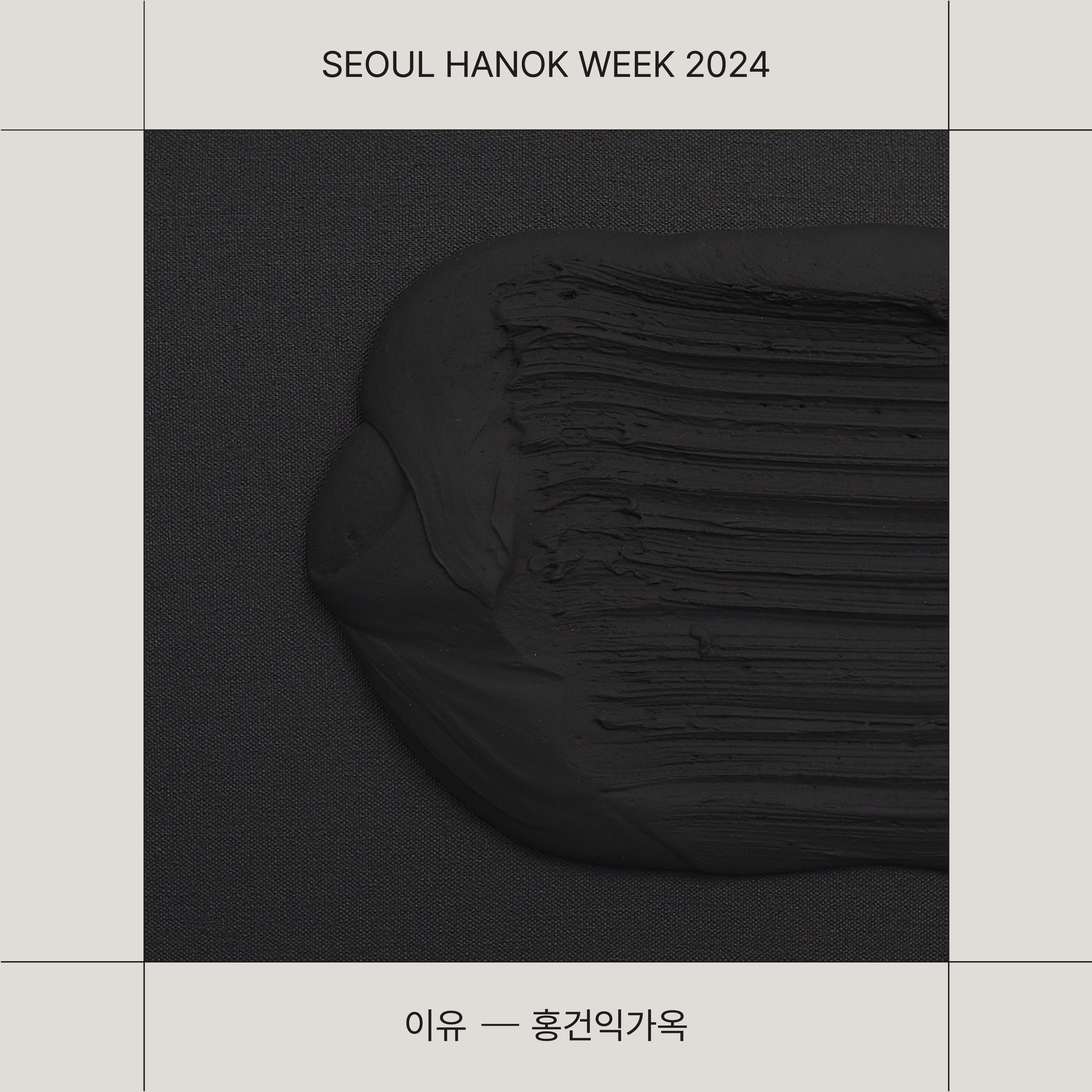
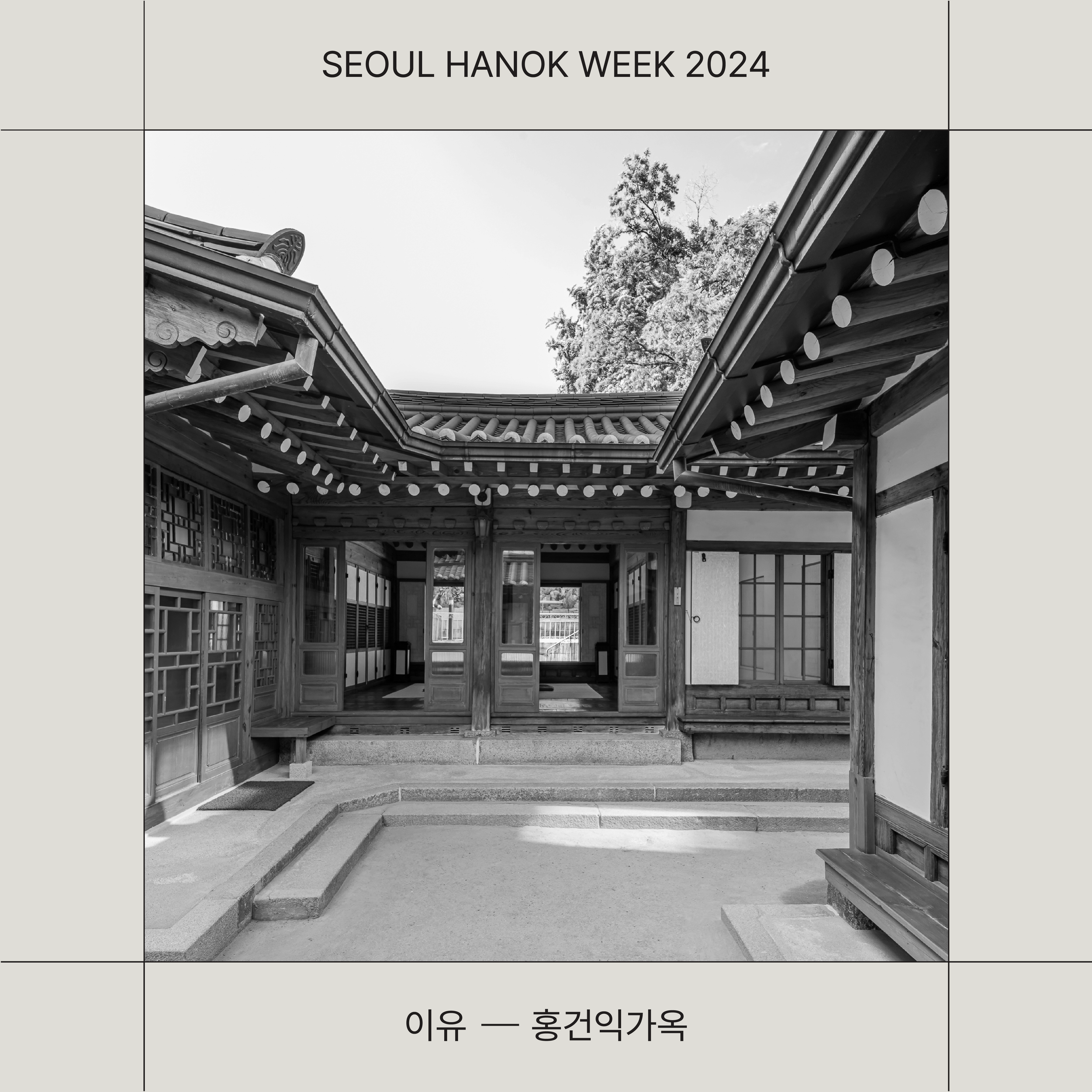
The branding for the Resonance of Space exhibition was connected to the identity of Seoul Hanok Week but differentiated through independent visual elements. In this project, the green color was excluded, and a color palette of black and ivory was used to express the grandeur, elegance, and calmness of Hanok. This choice of colors played a key role in conveying the multi-dimensional meanings of the exhibition and creating a serene atmosphere.
The graphic elements maintained consistency with the branding of Seoul Hanok Week while being expressed in a simpler and more restrained manner. The use of squares and their combinations, made with lines, once again conveyed a sense of space, visually delivering the exhibition’s theme of Hanok’s space and resonance.
The branding of these two projects reinterpreted the beauty of traditional Hanok architecture using modern design language. By utilizing differentiated colors and graphics according to the purpose of each, the design achieved a harmonious blend of tradition and modernity.
Client - Seoul, Kabinett
Project - Creative Direction, Brand Identity, Exhibition Designs