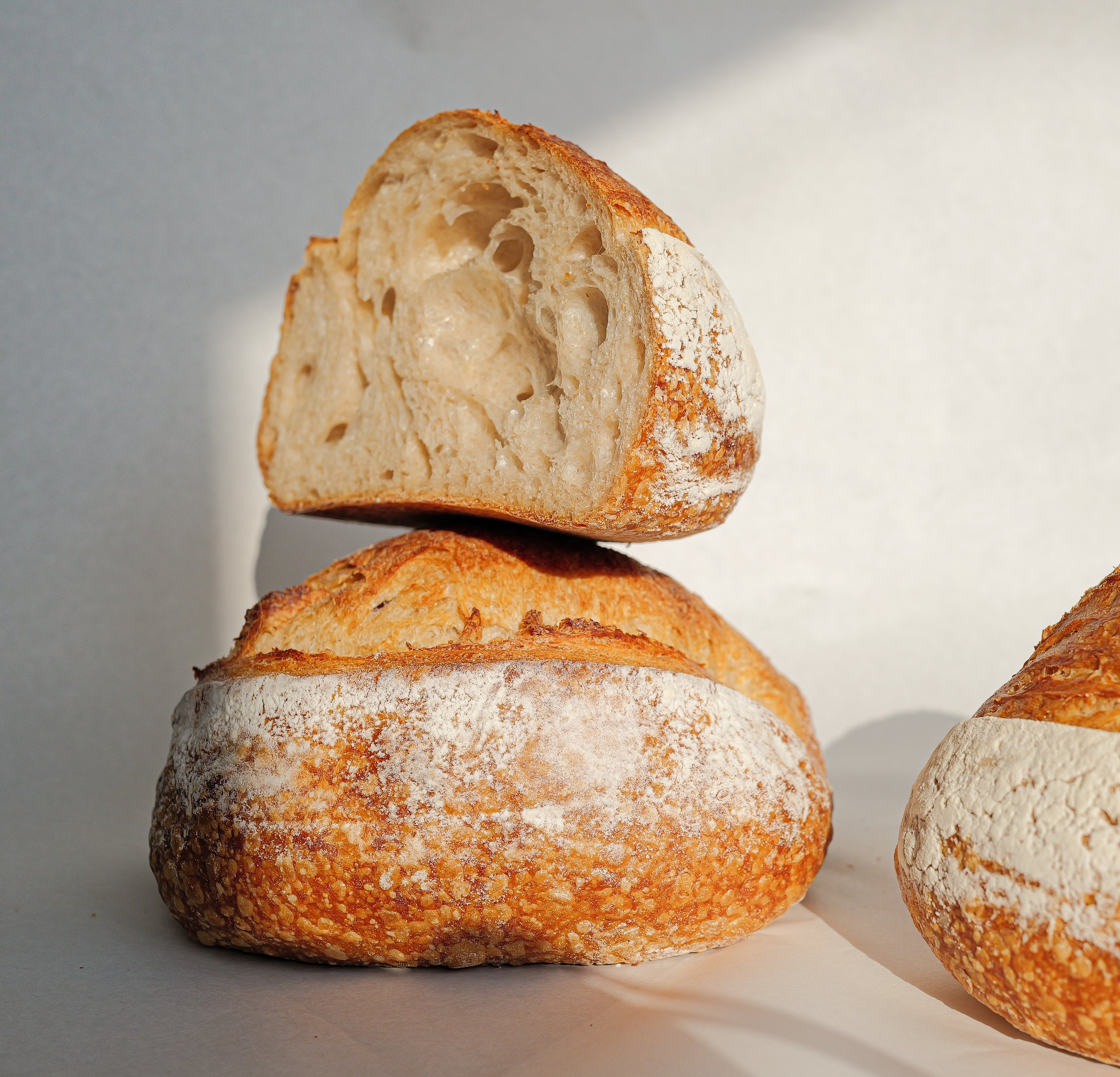
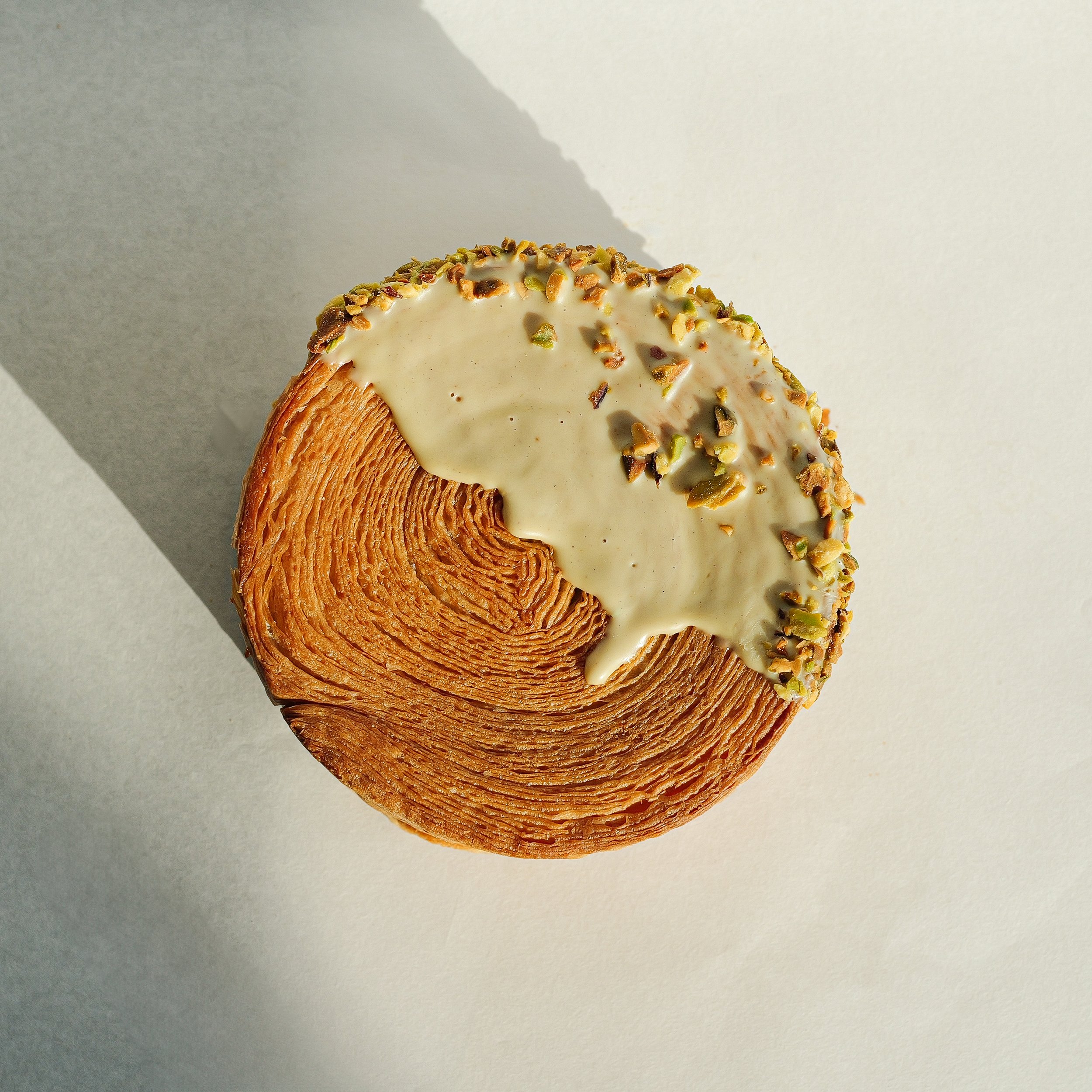
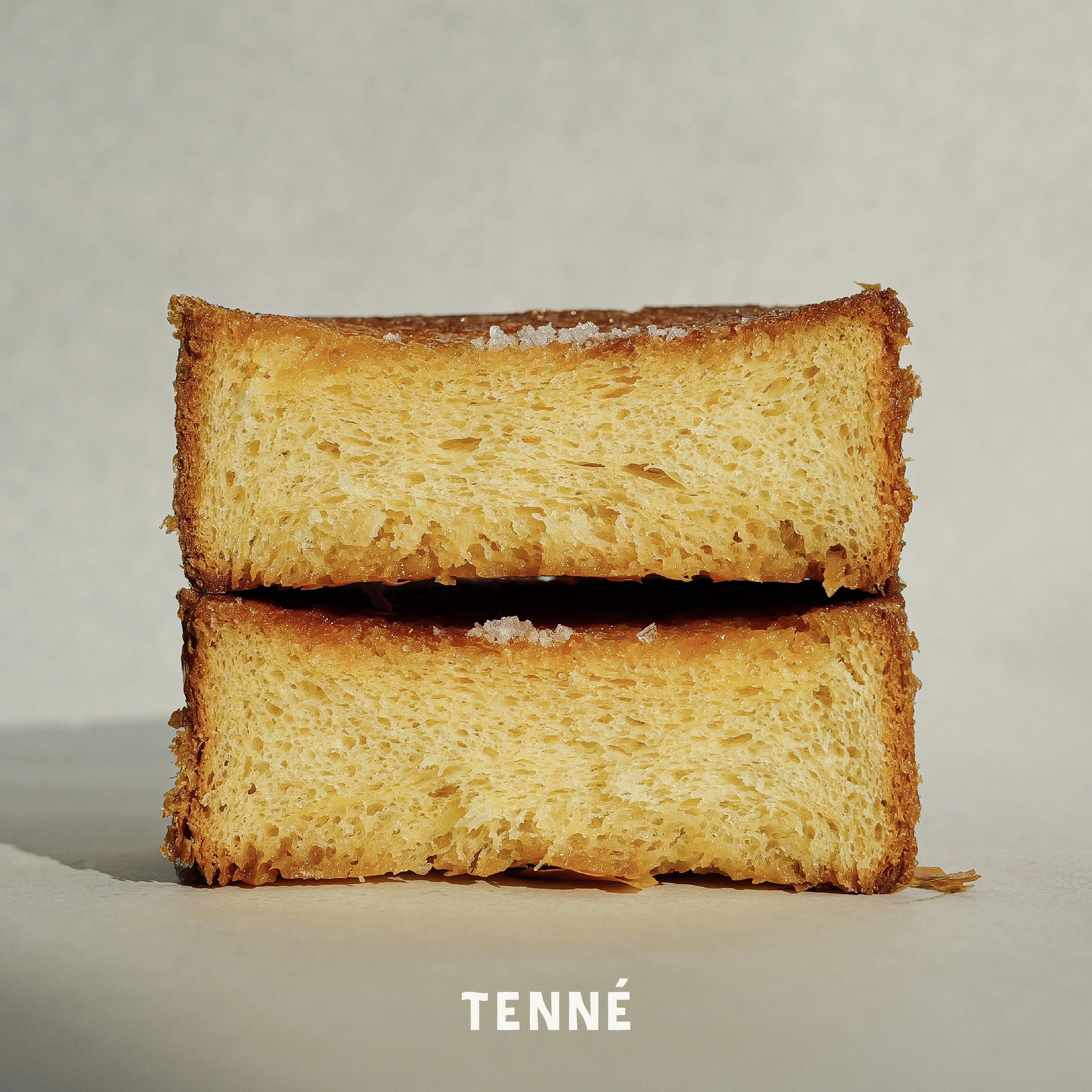
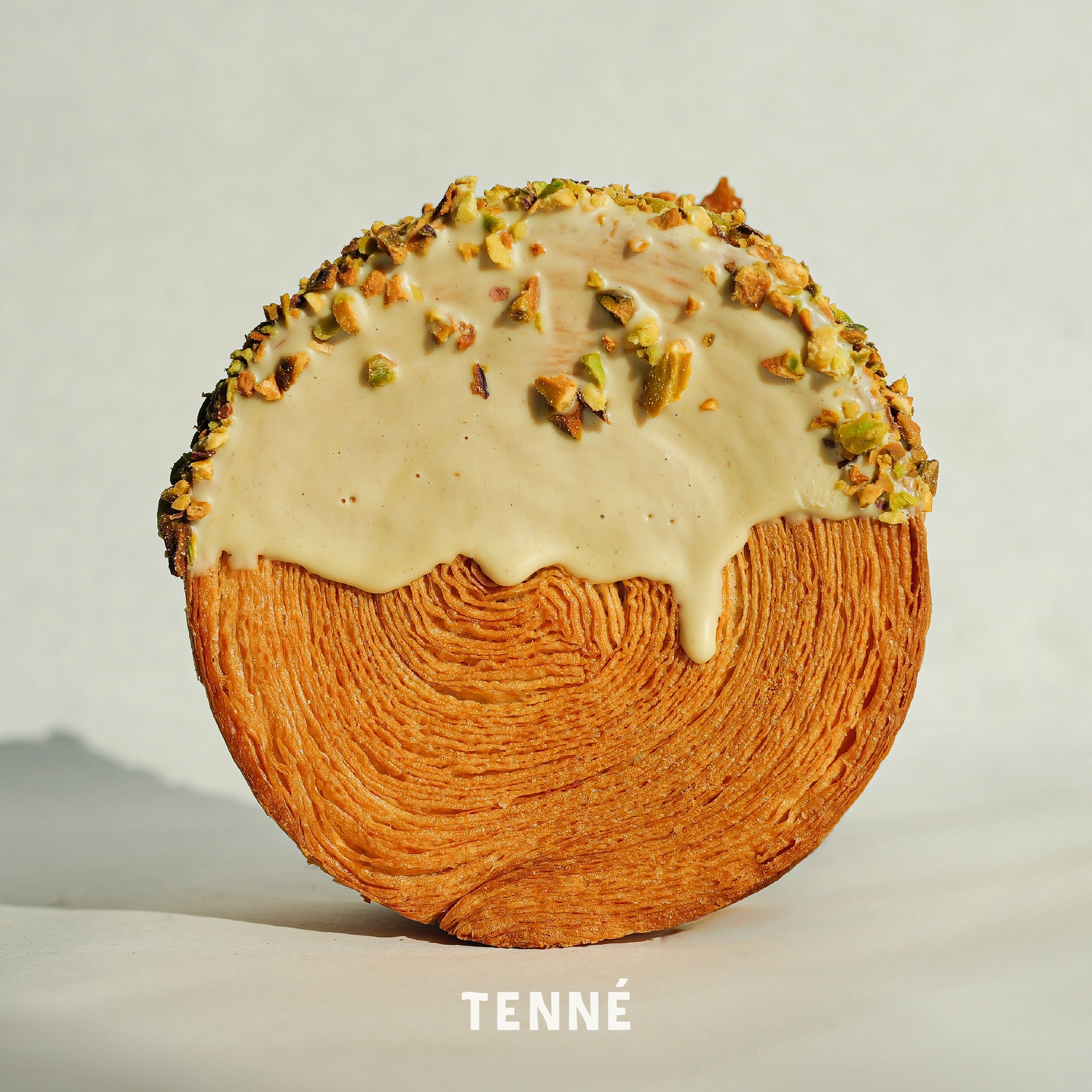
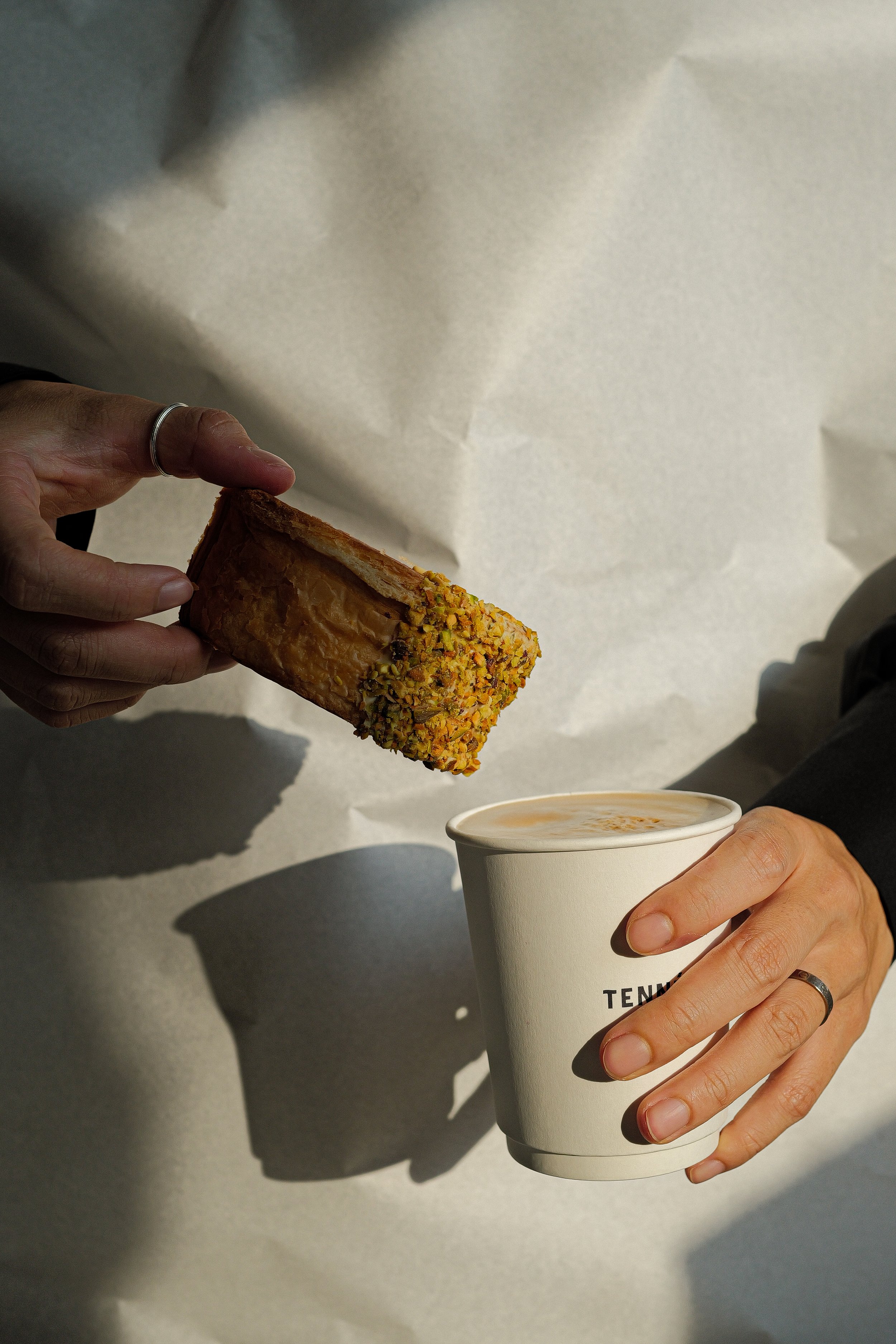
Tenne values every step of the process from the most basic dough to the bread itself in order to make the best bread. The warm and healthy bread we provide goes beyond simply filling you up, but also comforts and satisfies you at the beginning, end, and end of your day. We understand the impact that all these emotions have on people’s lives, and we work together to deliver a lasting positive impact.
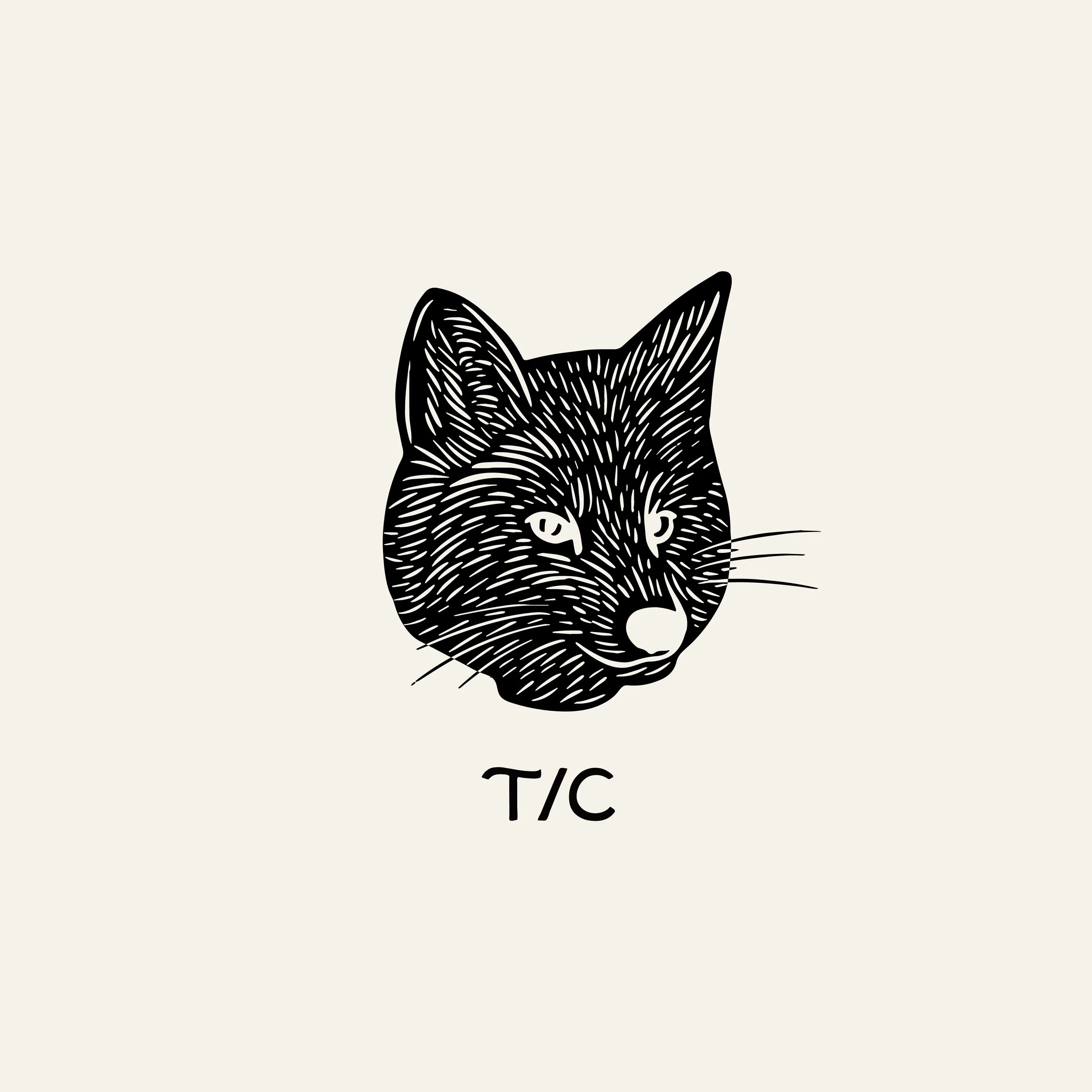
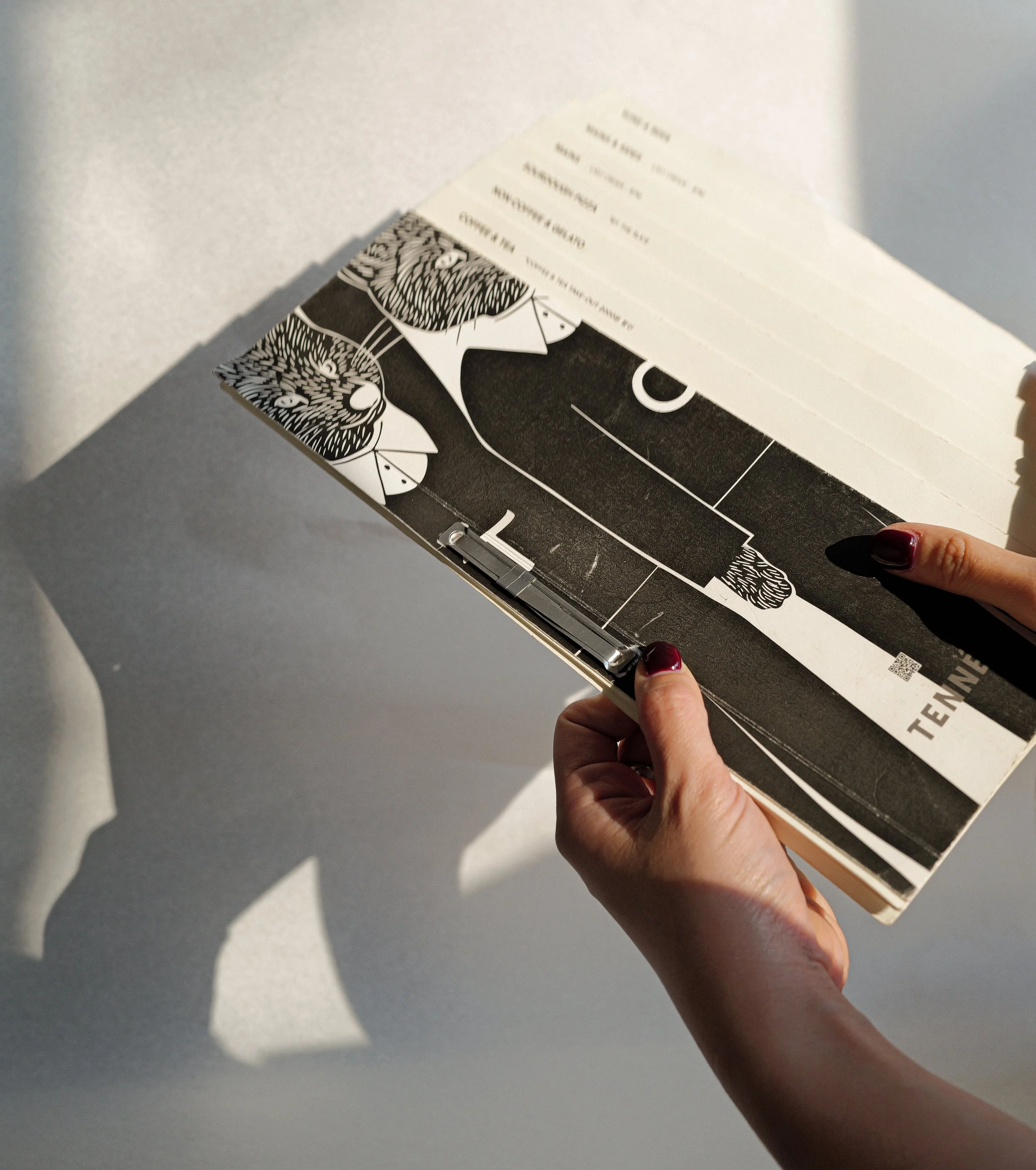
The core of Tenne’s new identity is an elegant combination of tradition and modernity. It features a unique typography using wave points rendered in a thick and narrow style that reflects the texture and elasticity of dough, the core of Tenne’s ‘dough specialist.’ The core of Tenne’s new brand symbol is two anthropomorphic foxes artistically designed to represent a father and a son. Standing upright in human clothing, these foxes are not only fun to watch, but also deeply symbolic. The duo, known as Two Tennes, are depicted holding a flag with wavy typography that reflects the design ethos of the logo, and are depicted in a variety of scenarios, including holding coffee and bread, being used alone, and using only the upper body, providing a versatile yet cohesive visual narrative that connects to the café’s products and basic symbol. The choice of the color ‘Tenne’ as the main color is intended to be a connection to Tenne’s existing identity and to contrast it with the muted palette of neutrals and black. This strategic use of color not only preserves the brand’s identity, but also highlights the orange-brown that symbolizes the warmth, craftsmanship, and burning passion of the father-son team.
Client - Tenne
Project - Creative Direction, Brand Identity, Product Photography, Packaging