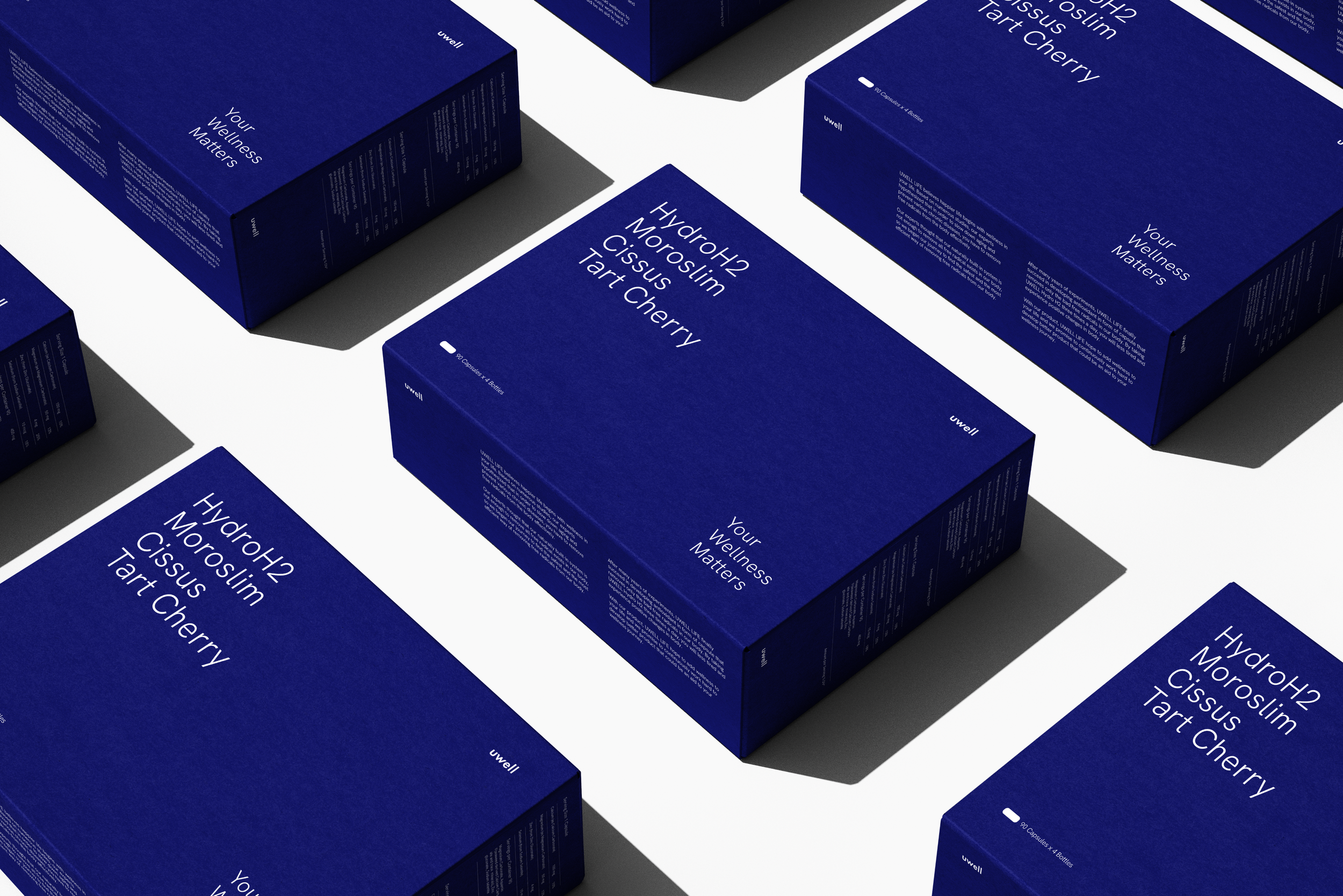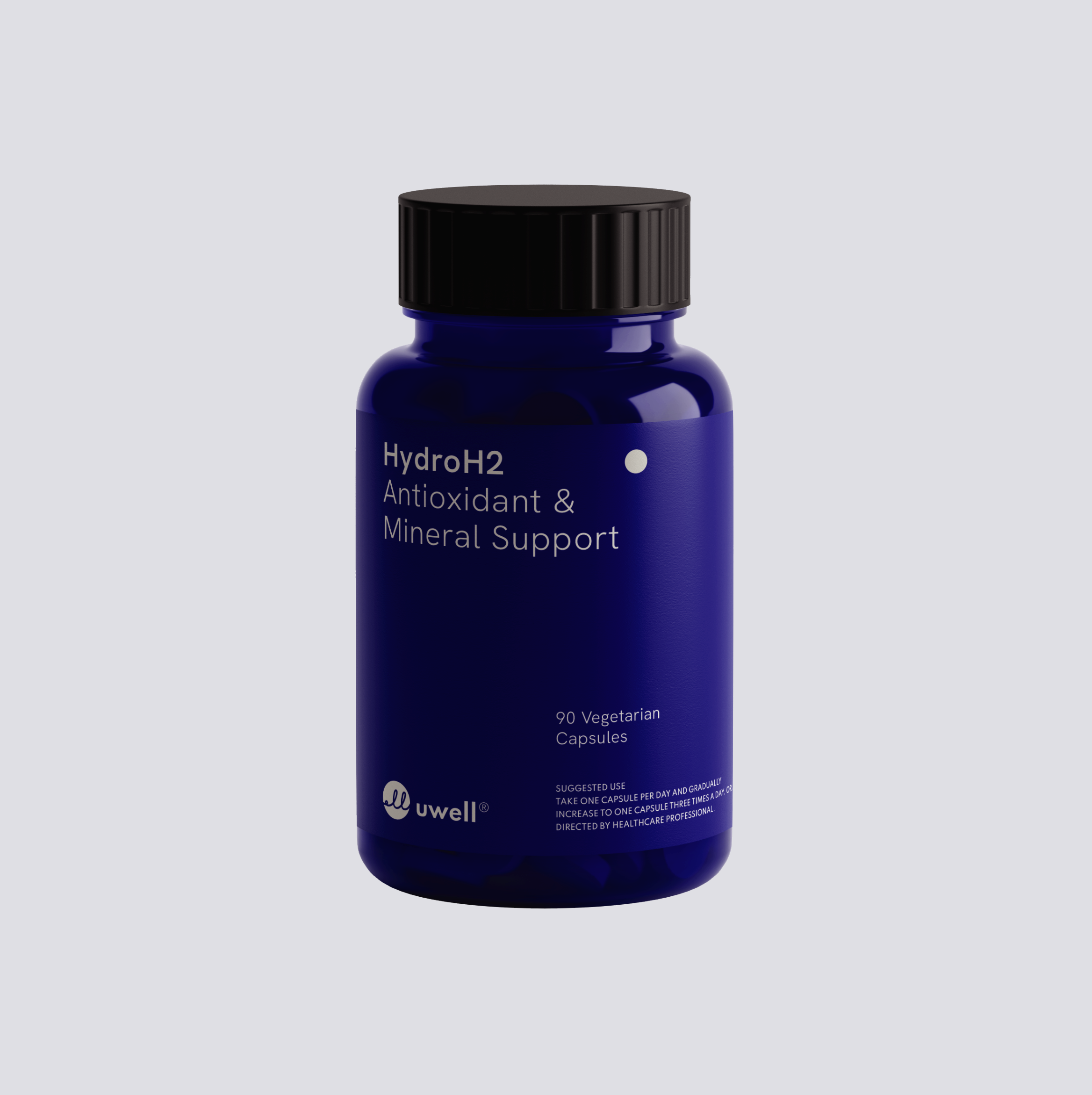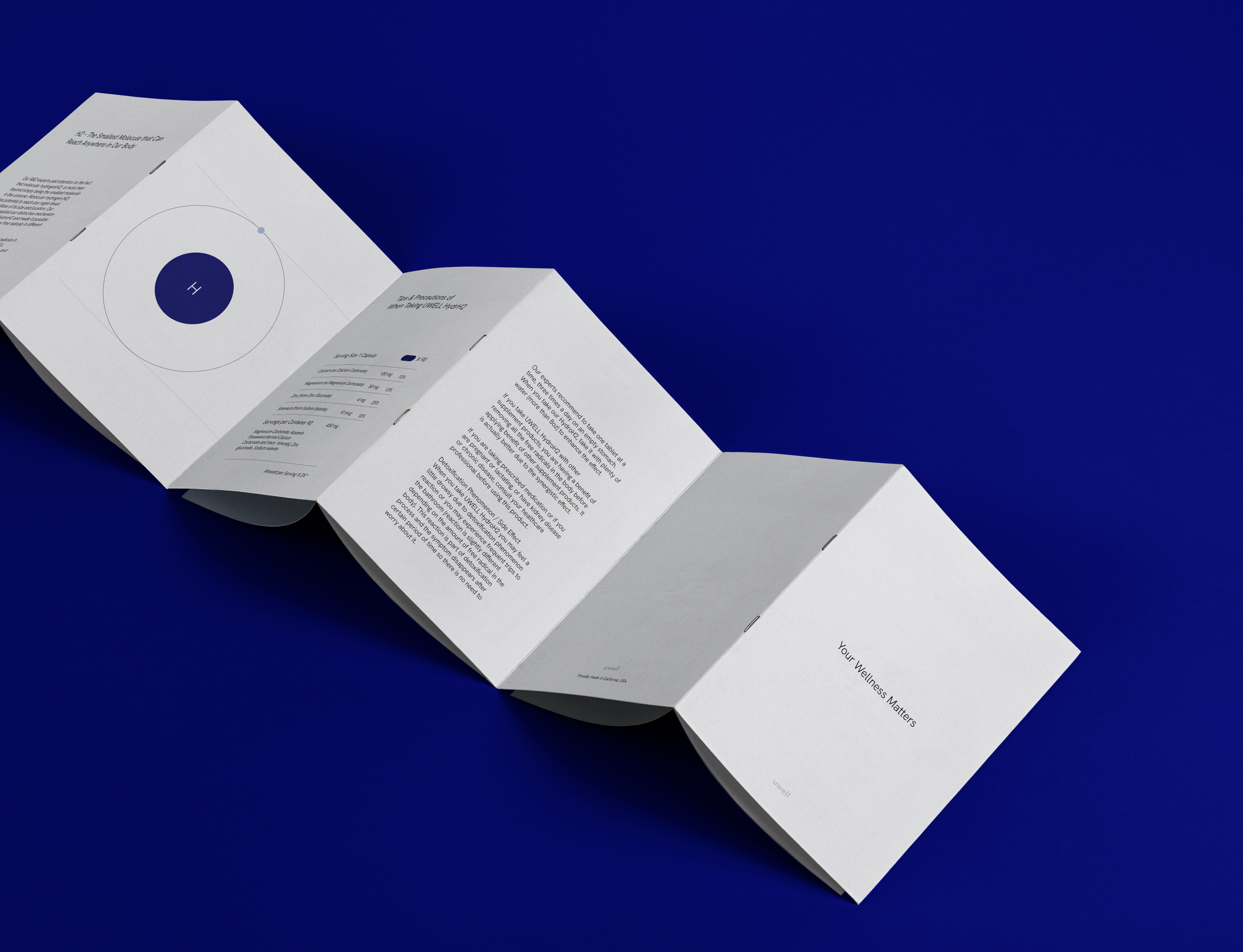
Luxury health food brand uwell is known for its carefully selected products that are clinically proven to help improve health and wellness. Undertaking a rebranding project to reflect the purity, precision and excellence of this revered brand has given the brand the power to continue to transcend the times.
In pursuit of perfection, TIN helped uwell be reborn by intervening in aspects such as logo, typography, and graphic assets. These elements redefine the brand in subtle yet radical ways. Launching with the Uwell HydroH2, which received rave reviews on social media, the brand's new branding remains faithful to the original image but is enhanced with a more minimalist aesthetic through individual direction of typography, icons, logos and product color ranges.
The Uwell rebranding project sought to modernize and reposition the brand while reinforcing its core values of ‘Purity, Precision, and Excellence’. With its minimalist design, blue color palette, and focus on transparency and quality, Uwell will endure and remain a symbol of trust and excellence in the luxury health food industry.
Client - Uwell
Project - Creative Direction, Brand Identity, Packaging


