For a place where you exist..
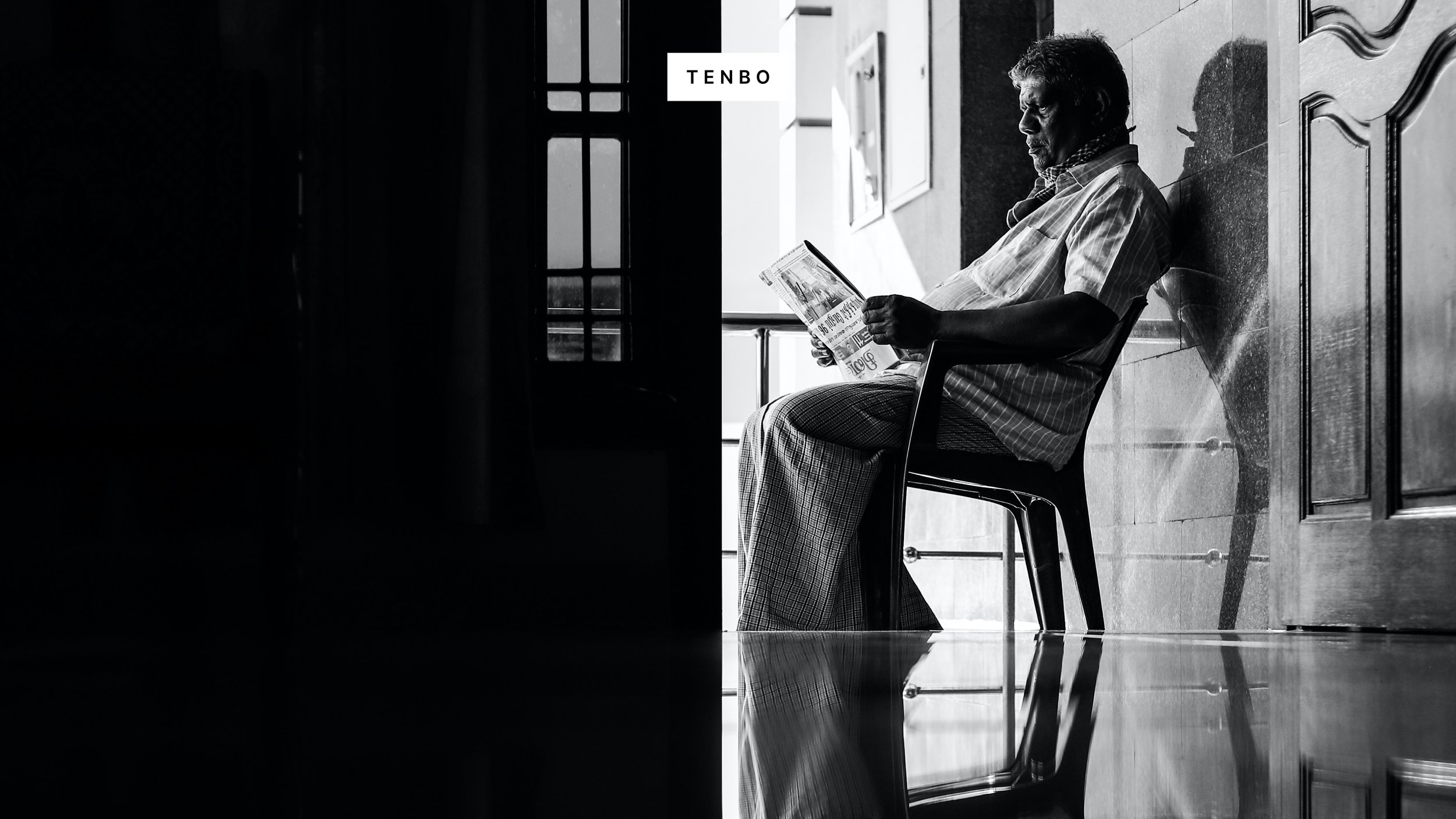
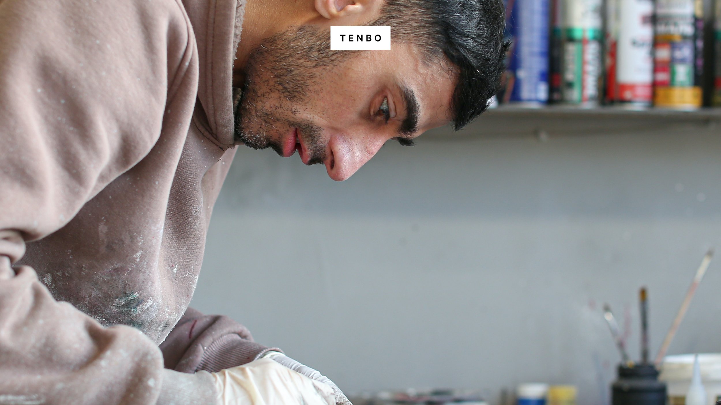
Beautiful spaces give a lot of meaning to the people who live in them. TENBO exists for people who love the space they stay in and the things that fill it, and who get energy from it. I also believe that every space, every task, and every object should be meaningful.
They approached TIN to create a home care brand. Our task was to create a naming, complete strategy and visual communication to bring the idea of “For a place where you exist” to life as a brand. As a first step, we tested various pronunciation combinations to create an exotic and memorable brand name, and the brand name TENBO was born.
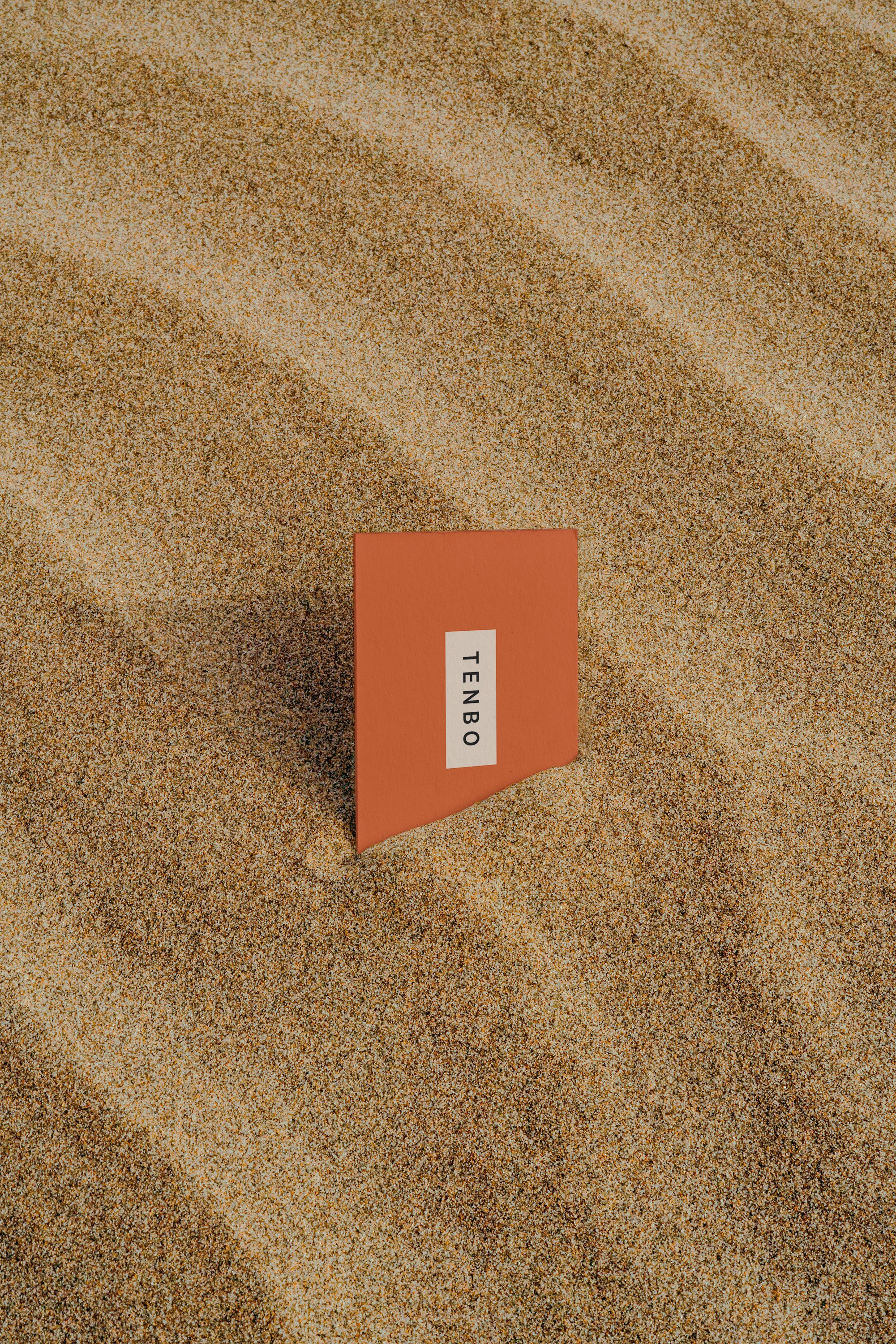
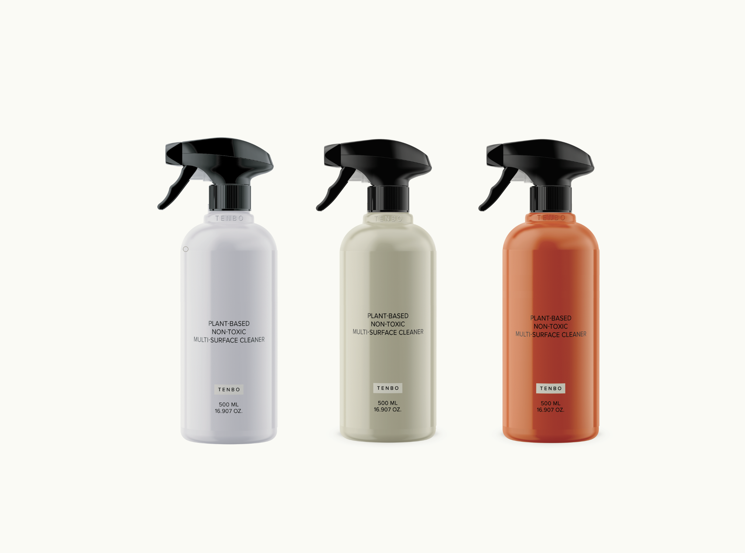
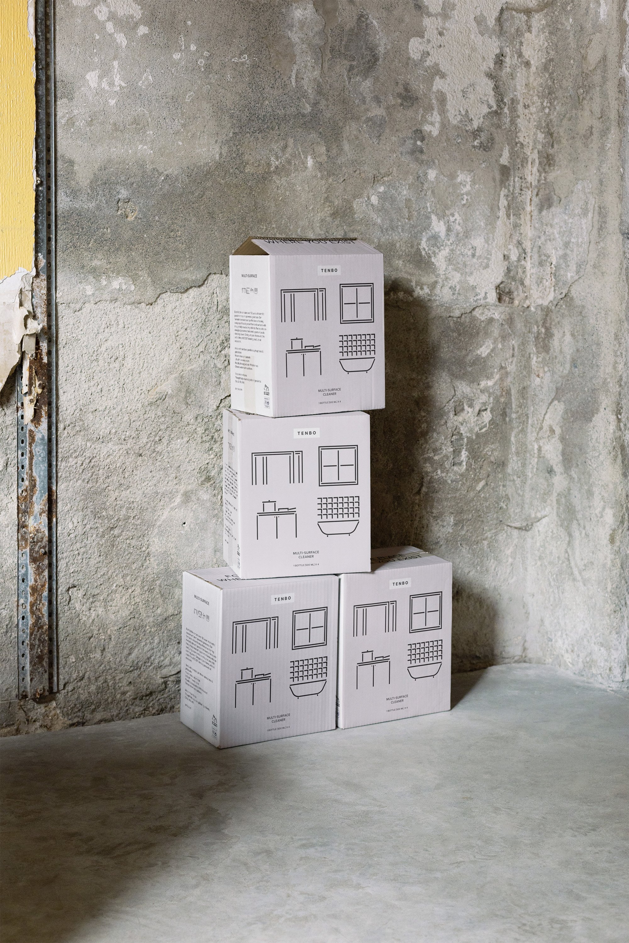
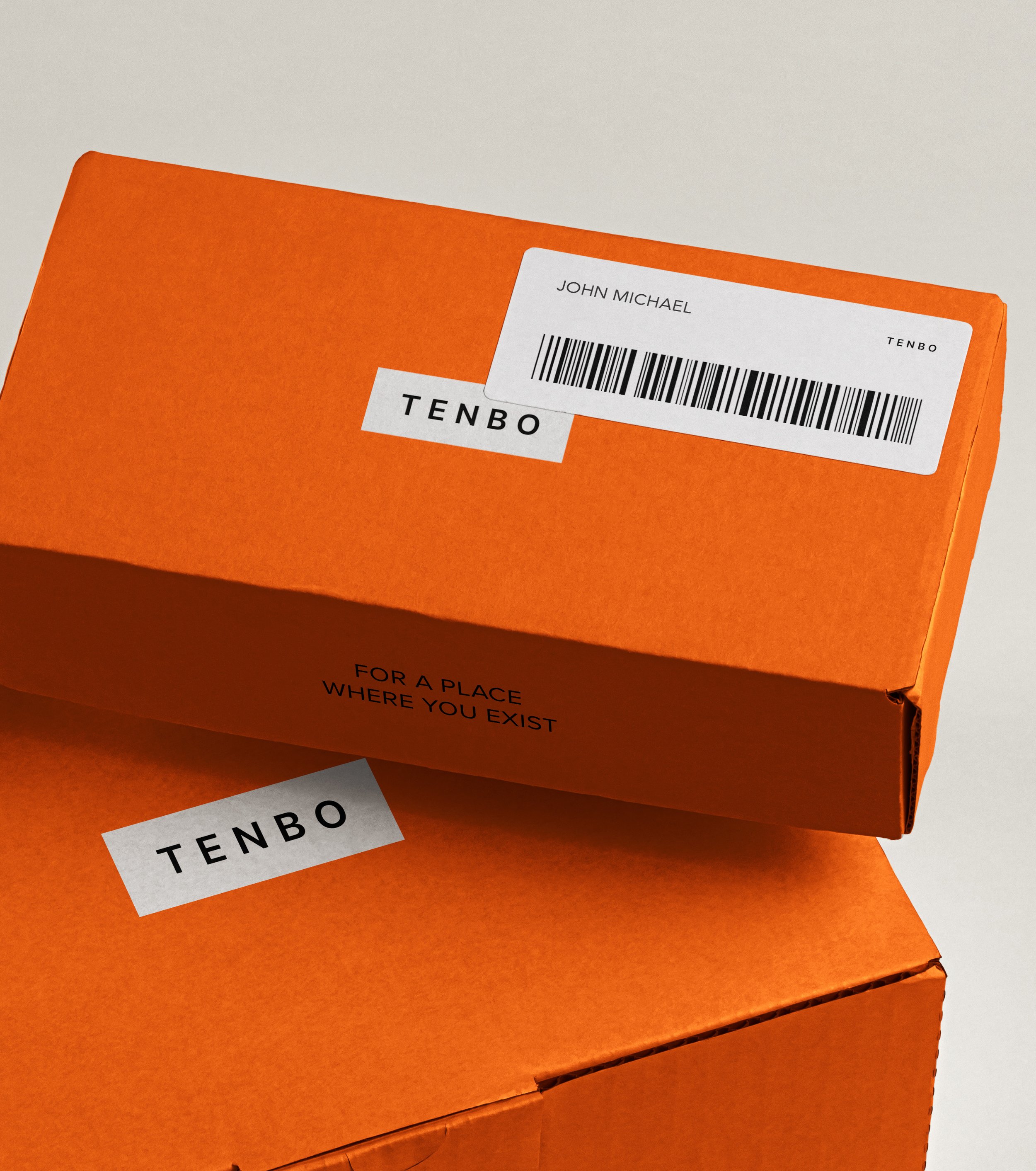
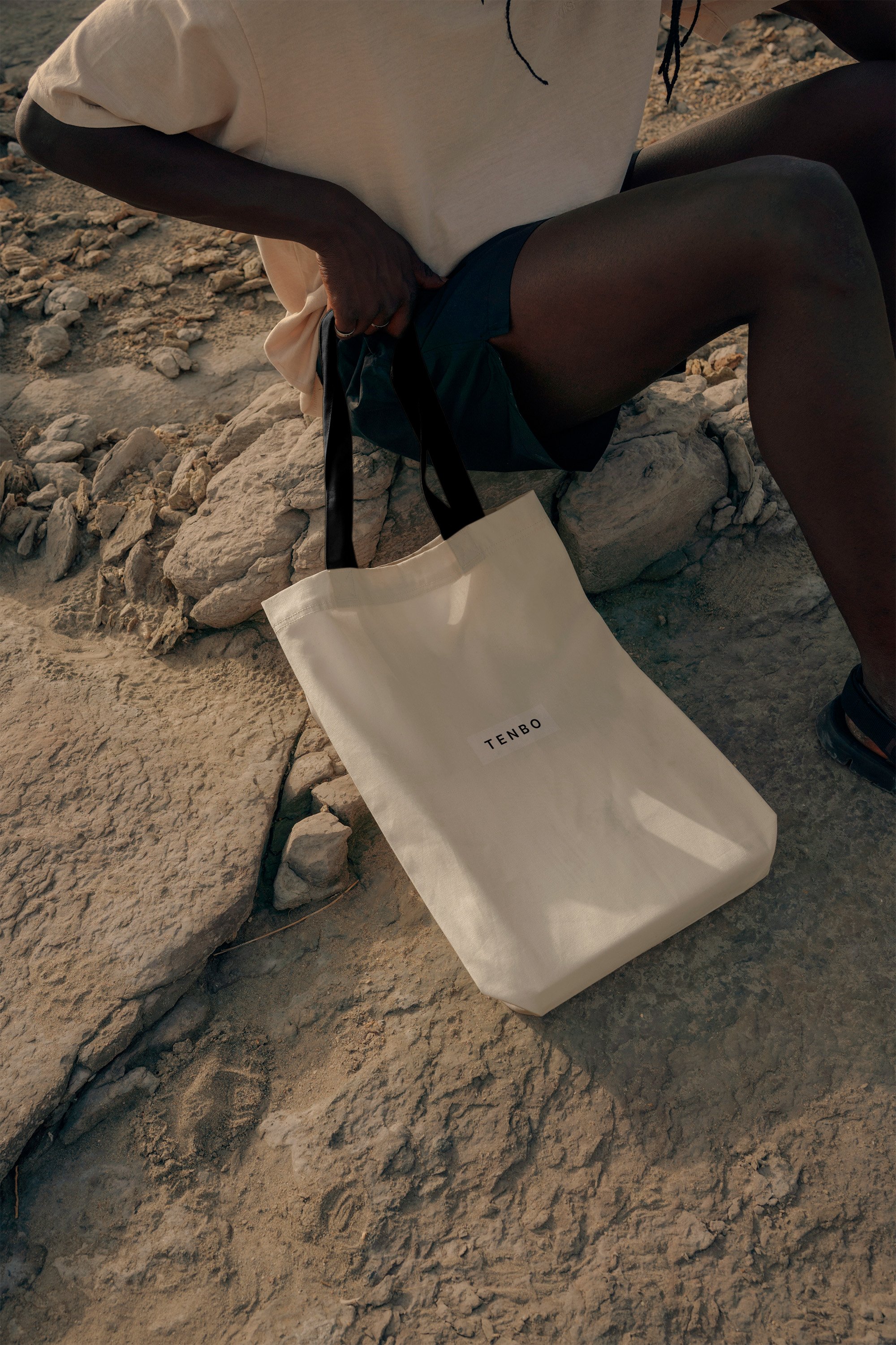
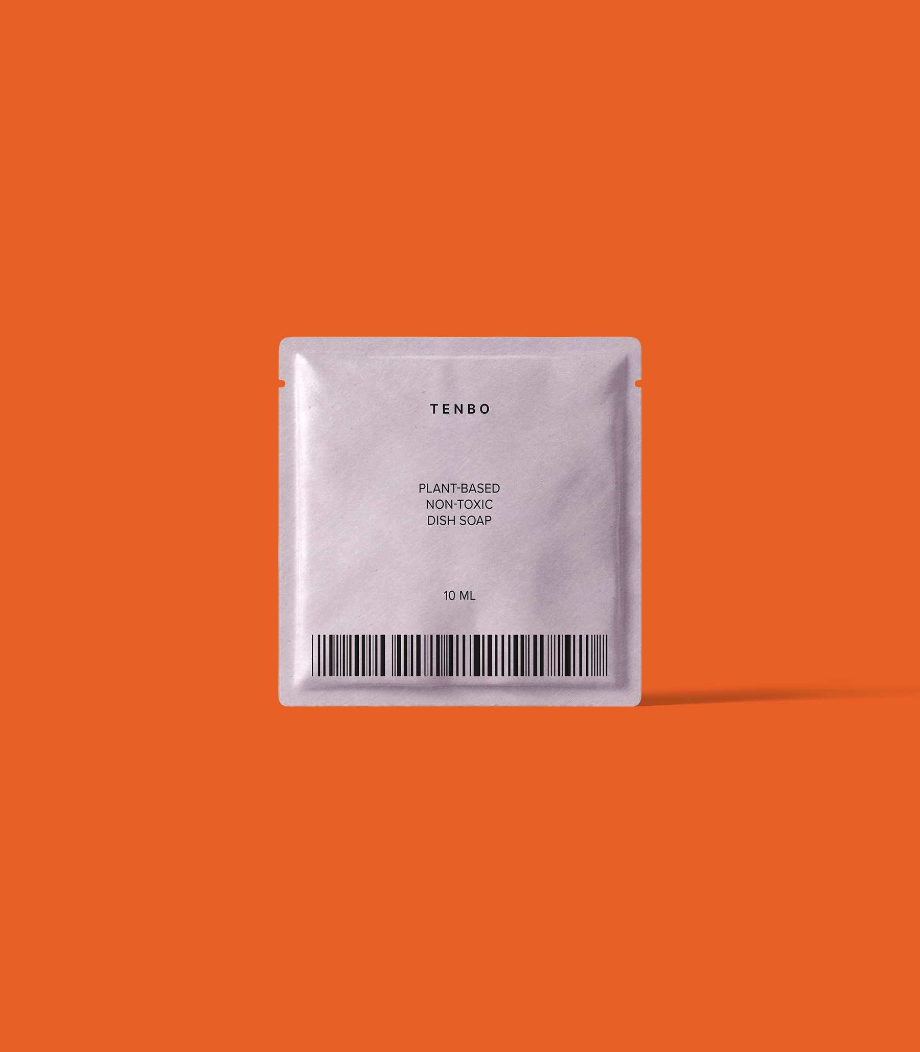
In addition, TIN developed a logo, color, and package label that could best highlight TENBO's product characteristics through various references and market research. The main colors, lavender gray and ginger orange, and the simple logotype represent Tenbo's four core values: aesthetic intelligence/elevation of meaning/space and consciousness/eco-friendliness, and the minimalist label clearly shows Tenbo's graphic assets developed by TIN. .
This project played an important role in building a new and meaningful identity for Tenbo, resulting in the brand gaining positive recognition from users and the market.
Client - Tenbo
Project - Creative Direction, Copywriting, Brand Identity, Packaging

