Gachi
Before child care products, there are great minds.
People prepare products to care for children before their caregivers. In the childcare product industry, which is dominated by products that promote children's safe and healthy growth, the lives of caregivers who care for those children are often overlooked. TIN carried out the rebranding project by deeply empathizing with GACHI's brand identity, which is that what is for the caregivers is ultimately for the children.
The first step was to change their name from “Gachi Milk Port” to “Gachi”. This is more than just a place to sell products, it is a modern and forward-thinking name that sharpens its vision while still maintaining Gachi's brand values and heritage.
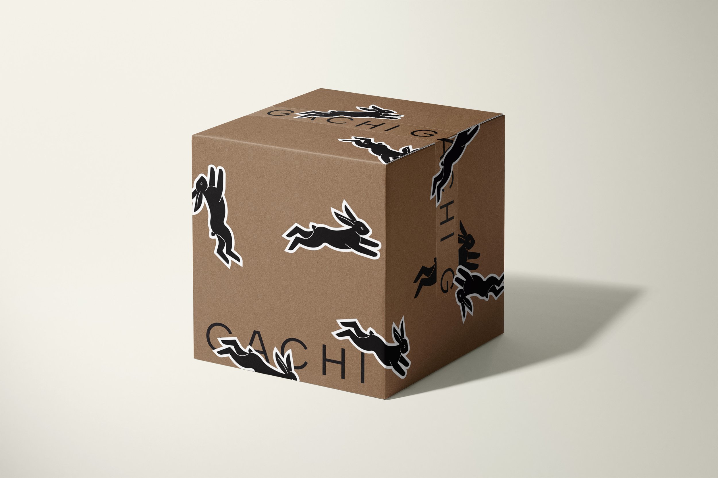
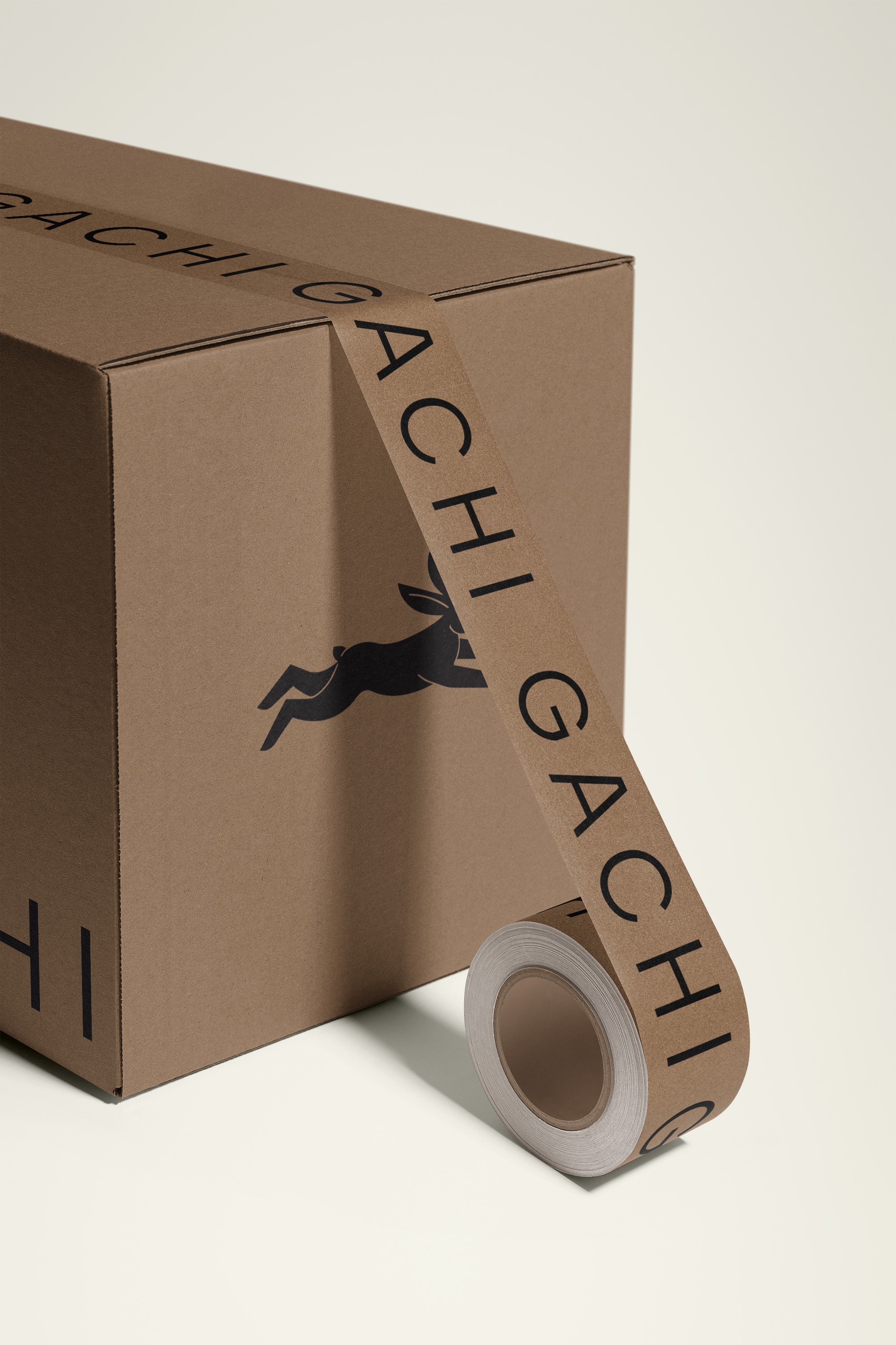
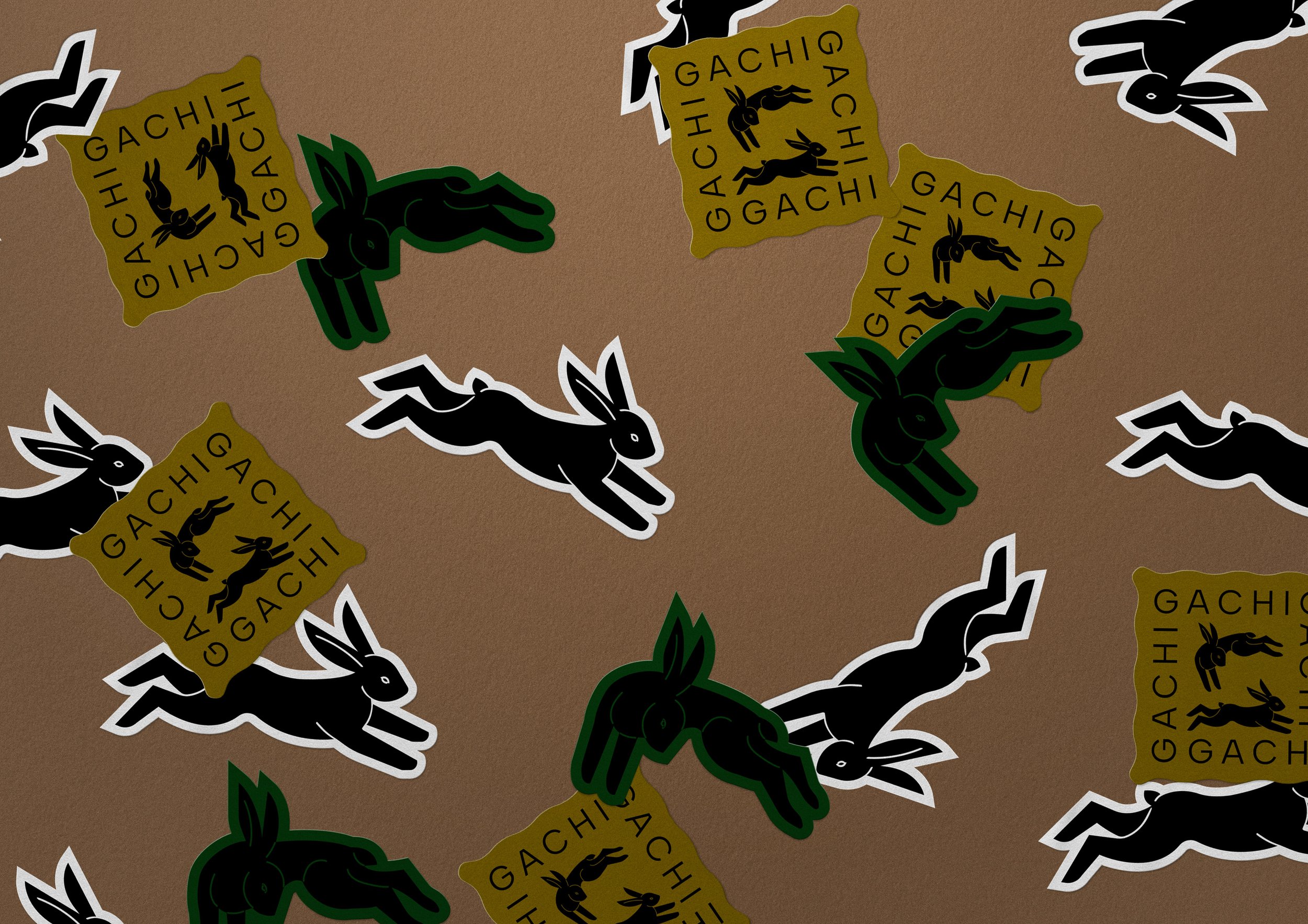
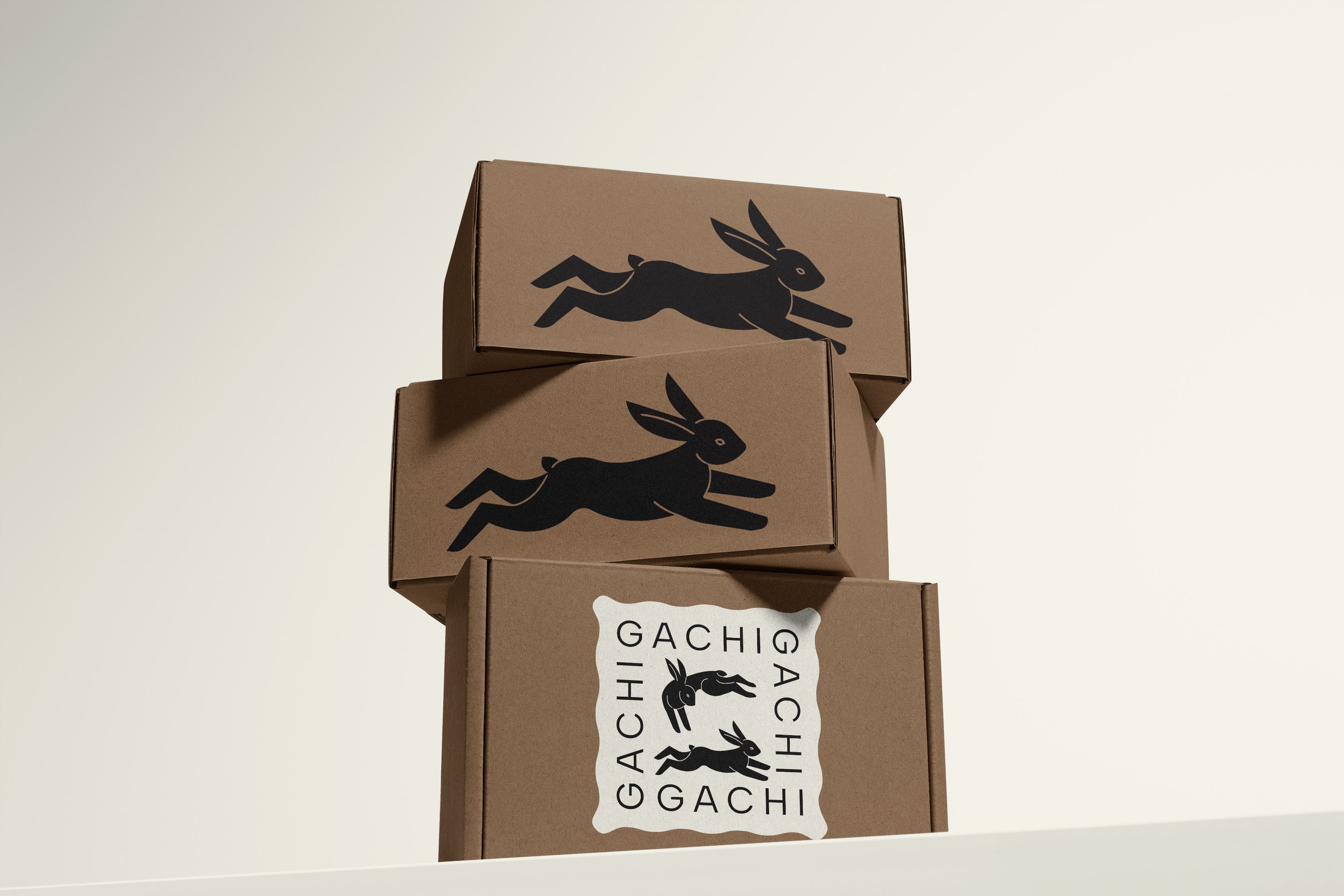
TIN's approach was to showcase the visual appeal that made Gachi unique, rather than the product itself. In the existing child care products market, there were many brands with cute and lovely identities reminiscent of children, but Gachi's logo conveys professionalism and reliability with sophisticated and modern typography to visually show that it is a brand for caregivers. do. The main symbol uses a minimalist rabbit.
This symbol, taken from the classic phrase 'children like rabbits', is a minimalist representation of a black rabbit and is used as an asset in various designs. The color palette is inspired by ‘nature’ and ‘care’ and adds a warm, modern and sophisticated mood to the overall visual identity. With a new visual identity and clear messaging, Gachi is ready to continue its mission to help caregivers maintain a harmonious balance between parenting and personal life.
Client - Gachi
Project - Creative Direction, Copywriting, Brand Identity, Packaging


